Batch effects
Introduction
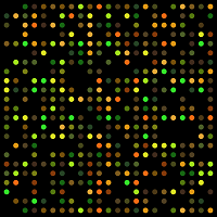
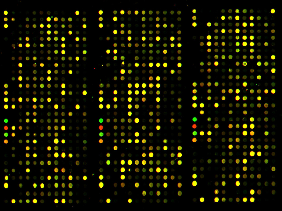
For my Advanced Biostatistics course this semester I gave a presentation about the problem of batch effects in microarray data analysis and I feel that it is worth expanding on in a post. DNA microarrays allow for the simultaneous measurement of thousands of genes from a cell sample. The surface of these arrays are a grid-like patchwork of probes, or oligos, which hybridize (i.e. bind) with copies of the cDNA made from cells. As probes are made up of a short sequence of nucleotides known to match certain genes (hence the term “oligonucleotides”) the target-probe hybridization intensity can be measured by tagging the samples with fluorescent dyes. Figure 1 below shows an example of what a DNA microarray looks like. The color intensity of the final array can be quantified, providing a numerical estimate of individual gene expression.[1]
Figure 1: A DNA microarray under the microscope
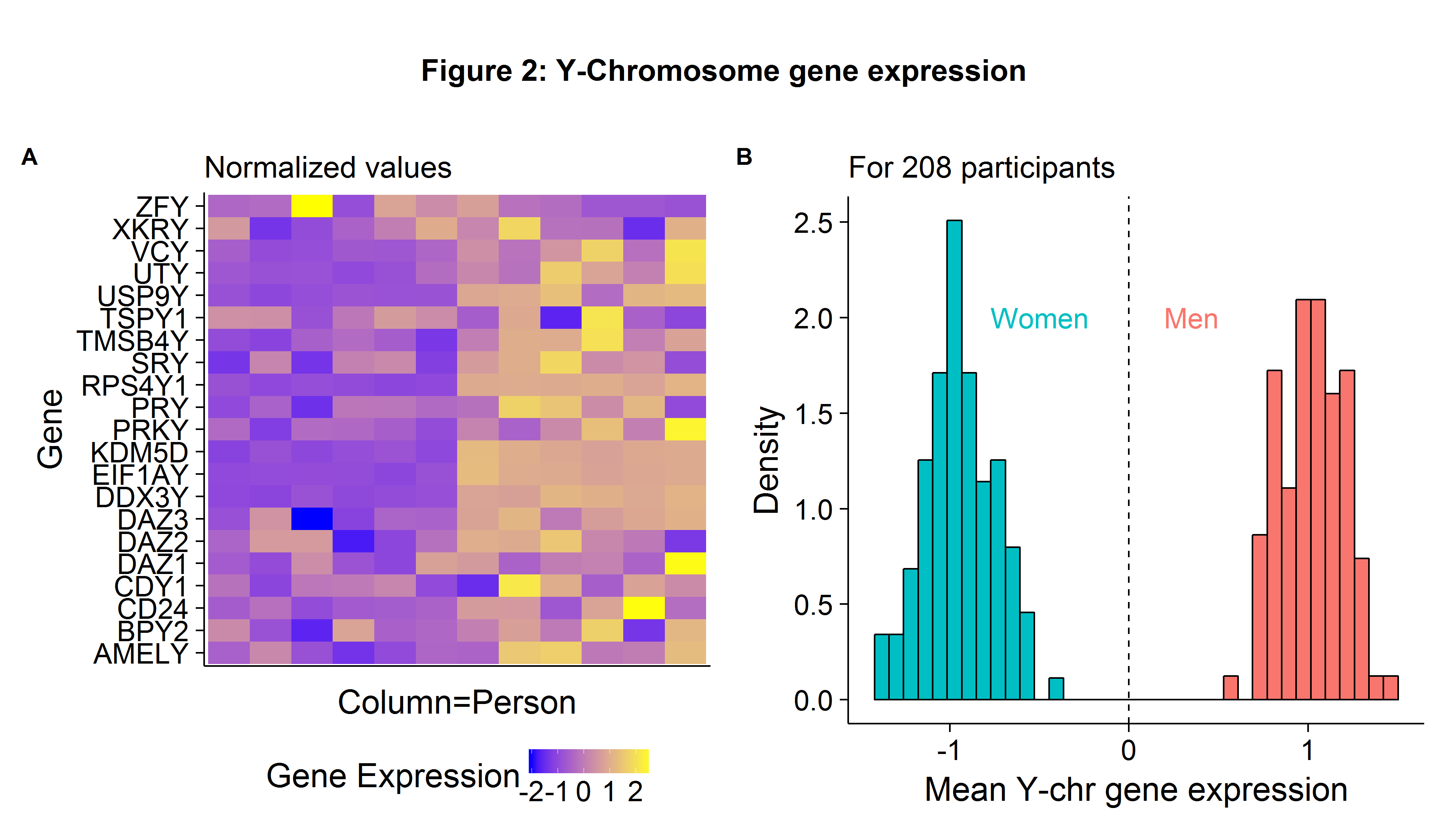
The uses of DNA microarrays in scientific research are numerous, including gene expression profiling (to help determine the etiology of diseases such as cancer) and comparative genomic hybridization (comparing the genome content for closely related organisms). To provide a toy example, we could use the sex-chromosome expression differences to determine if a cell comes from a male or female. Using the GSE5859 data set (which will be used again later), Figure 2A shows the normalized gene expression levels for 12 individuals and 21 Y-Chromosome genes. The data suggests that the six left-hand side persons (each column is a person[2]) are females because they have a lower-than-average expression for Y-chromosome genes. If we take the average expression values across all 208 persons which make up our sample, normalize the results, and plot the histogram, we can easily identify the gender of the individual samples (Figure 2B).
Batch effects: an applied example
While advances in massively parallel sequencing are leading more and more labs to use RNA-seq instead of classical microarrays, the latter are still cheap to produce and remain a good tool to learn basic genomic analysis. One problem with DNA microarrays is their susceptibility to batch effects which are any artifacts (non-biological sources of variation) that remain after normalization. Common reasons for batch effects include the:
- Magnitude of chemical reagents used on plates
- Time of day when the assay is done
- Temperature in lab
When the biological controls (i.e. cancer/non-cancer cells) are sequenced randomly, then batch effects will lead to increased noise. However, when the biological factors of interest are non-randomly sequenced and correlated with non-biological artifacts, batch effects will result in statistical inference which is biased. In Rafael Irizarry’s excellent introductory Data Analysis for Life Sciences he uses the example of Spielman et al. (2007) (published in Nature Genetics, a top journal) as an example of a study which fails to account for batch effects. The abstract states that:
[Q]uantitative phenotype[s] differ significantly between European-derived and Asian-derived populations for 1,097 of 4,197 genes tested.
Irizarry points out that since the biological controls (the ethnicity of the cell samples) were sequenced in batches, the differences in gene expression between the racial groups was likely the product of technical artifacts.
Processing and normalizing raw data
Throughout the rest of the post we will go through the Spielman paper, replicate their relevant results, find out if batch effects may have biased their conclusion, and then consider an adjustment procedure. As a student who has just recently entered the biostatistics world, I have been pleased to find a culture which promotes an open-source philosophy. Most journal articles are free to access and most data sets easily accessible. I believe this has helped to contribute to the rapid progress genomics has seen in the last decade, as well as for allowing critiques of existing papers and fixing deleterious practices. Researchers who suspect that batch effects may be the source of “surprising” results can download the data and check for themselves. We begin by going to the NCBI’s Gene Expression Omnibus and downloading the raw CEL files used in Spielman et al. (2007) paper.
# Change directory to CEL files
setwd(...)
# Read CEL files into an AffyBatch (may take a few seconds)
raw.data <- ReadAffy()
That was easy! To convert raw.data, an AffyBatch object, into an ExpressionSet object we need to use some sort of normalization measure. Spielman et al. notes in their Methods section that:
Expression arrays were analyzed using the Affymetrix MAS 5.0 software. The expression intensity was scaled to 500 and log2 transformed.
We can use the affy library’s mas5 function to carry out the necessary adjustment procedure.
# mas5 normalization
norm.data <- affy::mas5(raw.data,sc=500)
# Get expression data (and drop Affymetrix control genes)
GSE.exprs <- exprs(norm.data) %>% data.frame(rn=rownames(.),.) %>%
  filter(!grepl('AFFX',rn)) %>% set_colnames(NULL)
# Get probe IDs
GSE.probes <- GSE.exprs[,1] %>% as.character
GSE.exprs <- GSE.exprs[,-1] %>% as.matrix %>% log2
# Get Gene Symbol and Chromosome
GSE.zid <- mapIds(hgfocus.db,keys=GSE.probes,column='ENTREZID',keytype='PROBEID',multiVals='first')
GSE.sym <- mapIds(hgfocus.db,keys=GSE.probes,column='SYMBOL',keytype='PROBEID',multiVals='first')
GSE.chr <- mapIds(Homo.sapiens,keys=GSE.zid,column='TXCHROM',keytype='ENTREZID',multiVals='first') %>% str_c
# Create information table
GSE.info <- tibble(Probes=GSE.probes,Symbols=GSE.sym,Chromosome=GSE.chr)
GSE.info %>% head(4)
## # A tibble: 4 × 3
## Probes Symbols Chromosome
## <chr> <chr> <chr>
## 1 1007_s_at DDR1 chr6
## 2 1053_at RFC2 chr7
## 3 117_at HSPA6 chr1
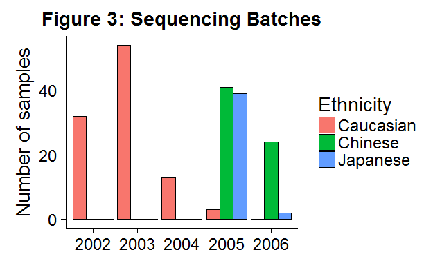
## 4 121_at PAX8 chr2The next and very important step in determining the nature of batch effects is to load the meta-data associated with this microarray. The sequencing date can be found using protocolData(raw.data)@data and to get the ethnicity I wrote a web-scraper to pull information off the NCBI and Coriell Institute websites (although there may be a Bioconductor package out there that would have simplified the process).
GSE.meta %>% head(4)## # A tibble: 4 × 5
## eth code gsm eth2 Date
## <fctr> <chr> <chr> <fctr> <date>
## 1 Japanese GM18956 GSM136441 Asian 2005-05-13
## 2 Japanese GM18942 GSM136442 Asian 2005-06-10
## 3 Japanese GM18944 GSM136443 Asian 2005-06-10
## 4 Japanese GM18945 GSM136444 Asian 2005-06-10In Figure 3 we can see that Caucasian people were sequenced in earlier years, whereas Asian individuals were sequenced in later years. The strong correlation between the biological variables of interest (ethnicity) and non-biological factors (lab/sequencing date) exposes this data set to the risk of batch effects.
Spurios findings?
To identify genes which are differentially expressed we can use a gene-wise t-test for mean equality. Note that because we are testing 8746 hypotheses (the number of measured genes) we need to apply some sort of multiple comparison adjustment. In the Spielman paper, they use the Sidak correction which has the following critical value: \(\alpha_{S}=1-(1-\alpha)^{\frac{1}{m}}\), or in \(-\log_{10}(\alpha_S)\)=5.2 at the 5% level. We will combine the Chinese/Japanese individuals into an Asian label as was done in the paper. We also use a slightly larger sample size in this analysis as:
Several CHB and JPT samples from the HapMap collection were excluded because cell lines were not available at the time of the study.
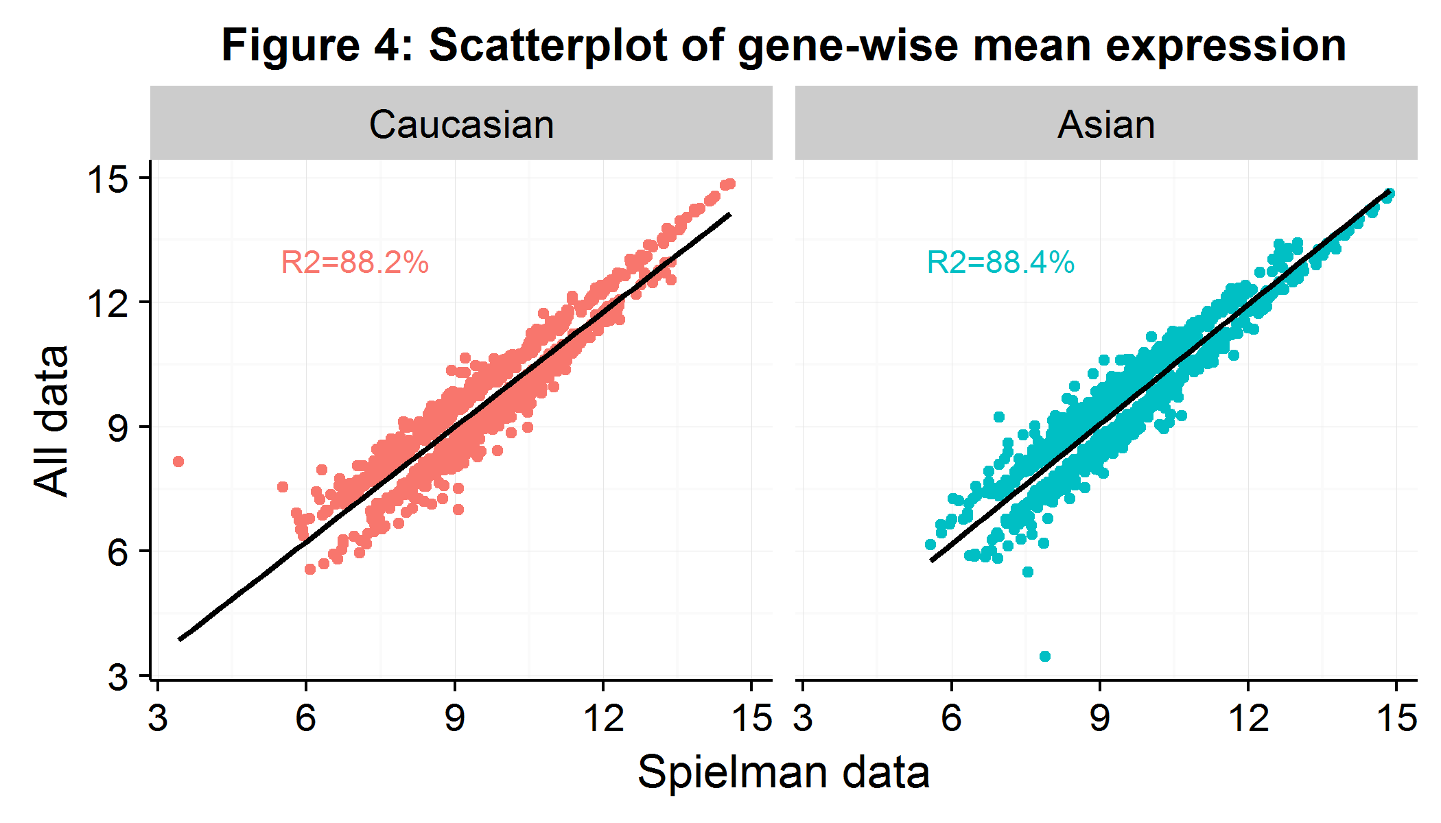
While I wasn’t able to determine which individuals were excluded, in the Supplementary Table 1 they provided a list of the 1000+ genes which were differentially expressed between the groups as well as the summary statistics for each gene. This allowed me to check that my expression values for these 1000+ genes were similar even though I had more individuals and used the affy::mas5 adjustment procedure. As Figure 4 shows, the average expression per gene is largely similar, suggesting that the rest of our analysis will closely match the paper’s. We drop six observations which are extreme outliers as measured by their Cook’s distance.
We then run gene-wise t-tests (for efficient implementation use genefilter::rowttests) comparing the mean expression between Caucasians and Asians, where we define statistical significance at the Sidak cutoff and biological significance at a gene expression difference of 0.5 in \(log_2\) (hence \(\approx 41\%\)). Figure 5A, a Volcano plot, visualizes the results of the gene-wise t-tests. We see that 1225 genes are differentially expressed (out of the 8746-6=8740 possible genes using the complete data set). In interpreting their result, the authors state that:
We found that the difference in expression for a set of phenotypes is accounted for by a simple aspect of population genetics. There are marked between-population differences in allele frequencies of the same SNPs that are associated with within-population regulation of expression… In other words, the population differences in these expression phenotypes are largely attributable to frequency differences at the DNA sequence level… In our analysis, we tested a large set of quantitative phenotypes. By our very stringent criteria, we identified specific genetic polymorphisms strongly associated with the differences between human populations in at least a dozen of these phenotypes.
On the Volcano plot, I have pointed out four of the eight genes which the paper highlights as being differentially expressed due to “regulatory mechanisms”. The expression value for these genes is shown in the adjacent Figure 5B. It is easy to see why the t-test would have an extremely small p-value when comparing the mean of Caucasian/Asian gene expression.
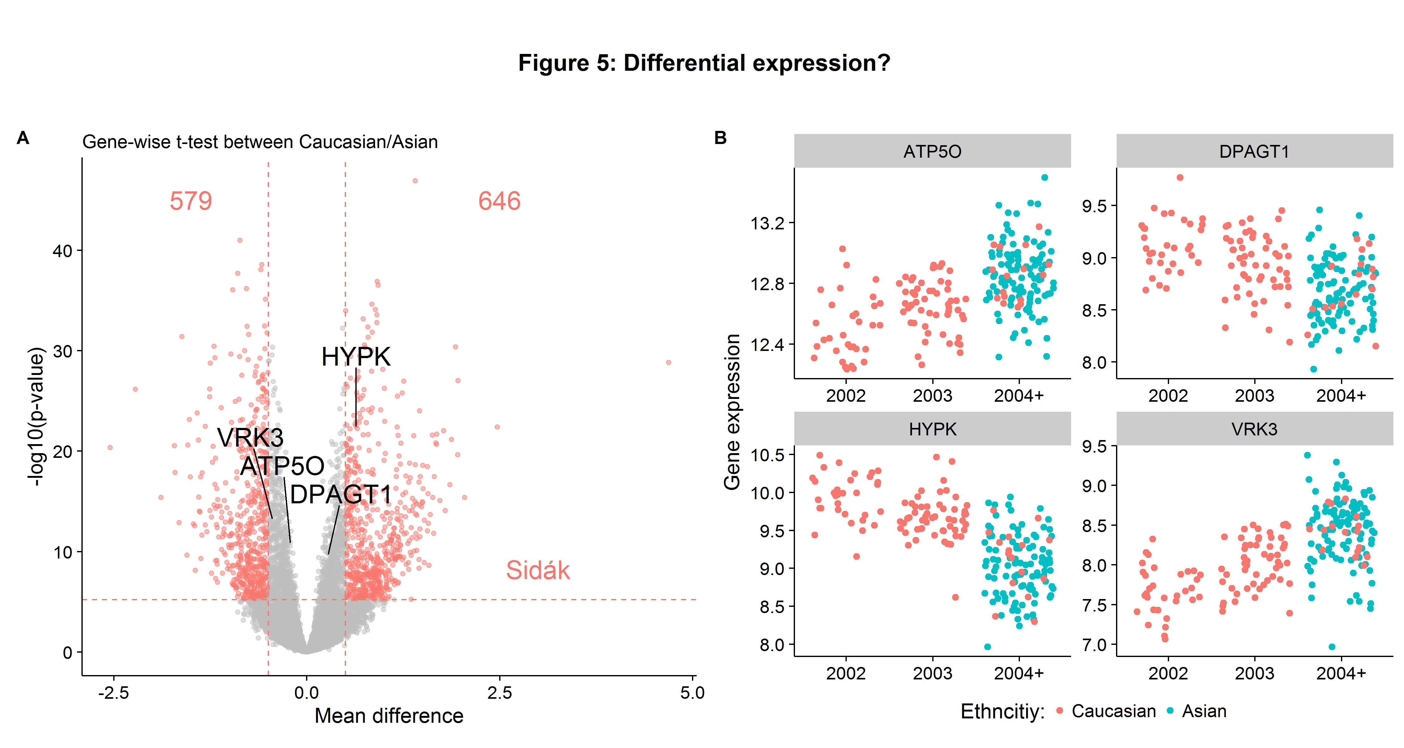
However, the highlighted genes in Figure 5B also suggest an issue of batch effects. There appears to be a shift in expression values over time independent of the ethnicity. Had this phenomenon been noted, several robustness checks could have been employed to check for batch effects:
- Gene-wise t-tests for mean expression difference between Caucasians in 2002 versus 2003 (to see if differences in expression are a function of date).
- Gene-wise t-tests for mean expression difference between Caucasians and Asians in 2004-2006 (and accounting for reduced power by Monte Carlo sampling).
- Analysis of variation within Asian group by lab/date sequence (to see if certain batches are driving results).
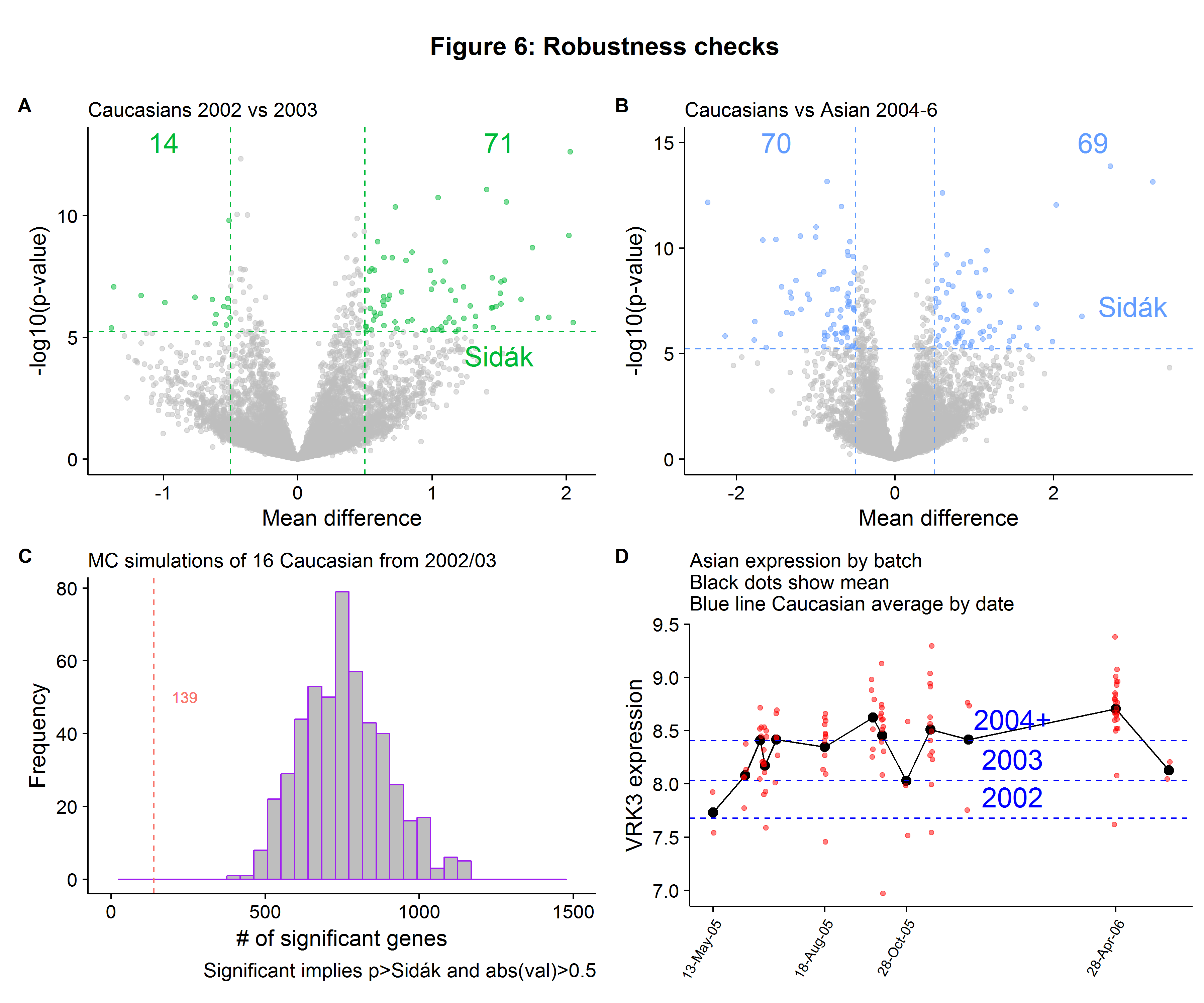
In Figure 6A we see that 85 genes are differentially between Caucasians in 2002 compared to 2003 (based on our threshold criteria[3]), fewer than 1225 overall, but suggests that at a minimum around 7% of the genes that had statistically significant differences were driven by the year of sequencing, rather than true biological variation. When we repeat the Caucasian versus Asian gene-wise expression tests but for only the samples sequenced in 2004-6, we see that only 139 are differentially expressed, which is only 11% of the total we found when using all the Caucasian individuals! However, this is not evidence of batch effects in and of itself, because only 16 Caucasians were sequenced in 2004 and onward so we have lower power for our tests. To compensate for this, we can randomly sample 16 Caucasians that were sequenced in 2002-3, record the number of significant genes and then compare this to the 139 result. Figure 6C shows that while the average number of genes differentially expressed was 757, this is much closer to the full sample number (1225) compared to the 2004-6 number (139). Therefore we can be fairly confident that most of the differentially expressed genes are due to batch effects. As a final robustness check, we can look into the variation within the Asian category. Figure 6D shows us that there is significant variation for the VRK3 gene we saw in Figure 5B, with the average expression depending heavily on the batch date, with some batches having expression values within the Caucasian range.
Checking for batch effects ex ante
The Spielman paper provided us with a motivating example as to the importance of checking for batch effects, as failing to do so can lead to erroneous inferences. In this section I provide two very simple visualization strategies that should be used after the normalization step to help the Biostatistician determine if further adjustments will be necessary:
- Correlation between the principal components and batches
- Multidimensional scaling for cluster analysis
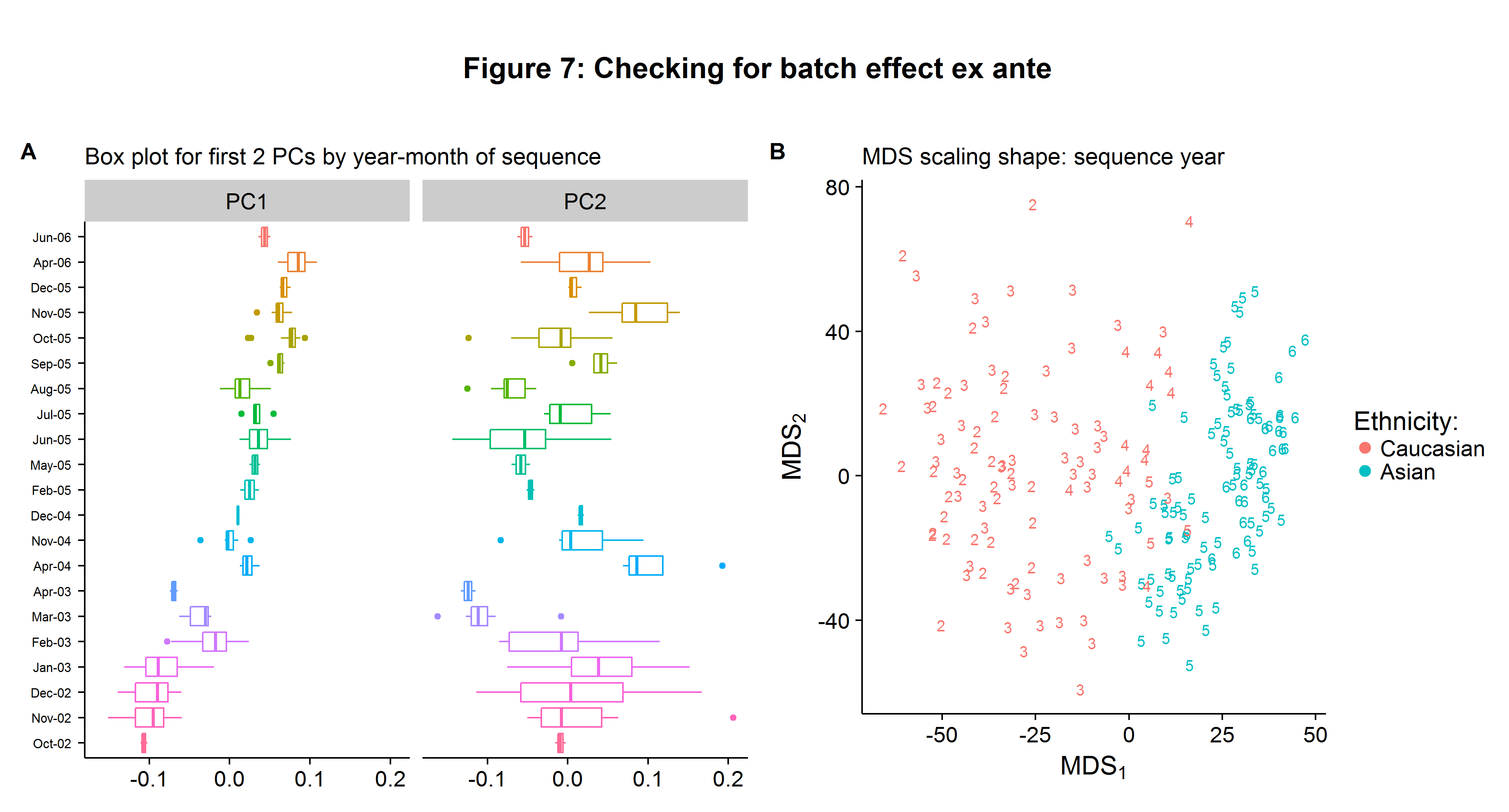
Calculating the principal components is extremely easy and can be done efficiently using the svd function (remember to normalize the data first). Figure 7A shows the box plots for the first and second principal component. While the horizontal axis scale does not have a clear interpretation, the relative distances between the different batches remain important. We can clearly see that there is trend in the first principal component of the data that is a function of the batch date. Recall that the first principal component represents the largest share of variation contained in our data, and therefore we do not want it to be correlated with non-biological factors when performing statistical inference. In contrast, the batch-specific moments appear uncorrelated with the sequencing date for the second principal component.
To produce a visualization tool to check for clustering patterns in our data, we can use the classical Multidimensional (MDS) Scaling technique, which is an algorithm which (approximately) maintains the distance between observations in higher dimensional space on a 2-dimensional surface. Implementing the classical MDS procedure can be done quickly using the following matrix algebra:
\(\newcommand{\bD}{\boldsymbol D^{(2)}}\) \(\newcommand{\bB}{\boldsymbol B}\) \(\newcommand{\bJ}{\boldsymbol J}\) \(\newcommand{\bI}{\boldsymbol I}\) \(\newcommand{\bo}{\boldsymbol 1}\) \(\newcommand{\bE}{\boldsymbol E_2}\) \(\newcommand{\bL}{\boldsymbol\Lambda_2^{1/2}}\)
- Calculate the (squared) Euclidean distance between each point: \(\bD\)
- Apply the following centering: \(\bB=-\frac{1}{2}\bJ\bD\bJ\), where \(\bJ=\boldsymbol \bI-\frac{1}{n}\bo\bo’\)
- Get the two largest eigenvalues in a diagonal matrix \(\bL = diag(\lambda_1,\lambda_2)\) and eigenvectors \(\bE = [e_1,e_2]\)
- Calculate the MDS matrix \(X=\boldsymbol \bE \bL\)
The classical MDS approach can be implemented with the following R code.
EX <- t( (GSE.exprs - rowMeans(GSE.exprs))/rowSds(GSE.exprs) )
# Calculate D
D <- dist(EX,diag=T,upper=T)^2 %>% as.matrix
# Calculate J
J <- diag(n) - (1/n) * matrix(1,ncol=n,nrow=n)
# Calculate B
B <- (-1/2)*(J %*% D %*% J)
# Get the two largest eigenvalues/vectors
E <- eigen(B)
Lambda.m <- diag(E$values[1:2])
E.m <- E$vectors[,1:2]
# Get X
X <- E.m %*% sqrt(Lambda.m)
After plotting the results of \(X\) in Figure 7B we can see that the Caucasian/Asian groups form independent clusters, suggesting genetic dissimilarity between the two groups. However, we also see that the sequence years also form their own clusters independent of ethnicity highlighting the problem of batch effects!
Combating batch effects with ComBat
ComBat uses a parametric Empirical Bayesian framework to adjust for known batch effects (see the original paper here). In this data set we have identified the batch date as a source of non-biological variation. ComBat is robust to small batch-sample observations, which is important as our batches range from 2-23 samples (with a batch defined as a given year-month). As opposed to simpler linear models, ComBat is able to pool information across genes. Implementing ComBat in R is easy with the sva::ComBat function:
# Get the batch factor
batch <- format(GSE.meta$Date,'%b-%y') %>% factor
# Run ComBat
combat_edata = ComBat(dat=GSE.exprs,batch=batch,par.prior=TRUE, prior.plots=FALSE)
# Run t-ttests
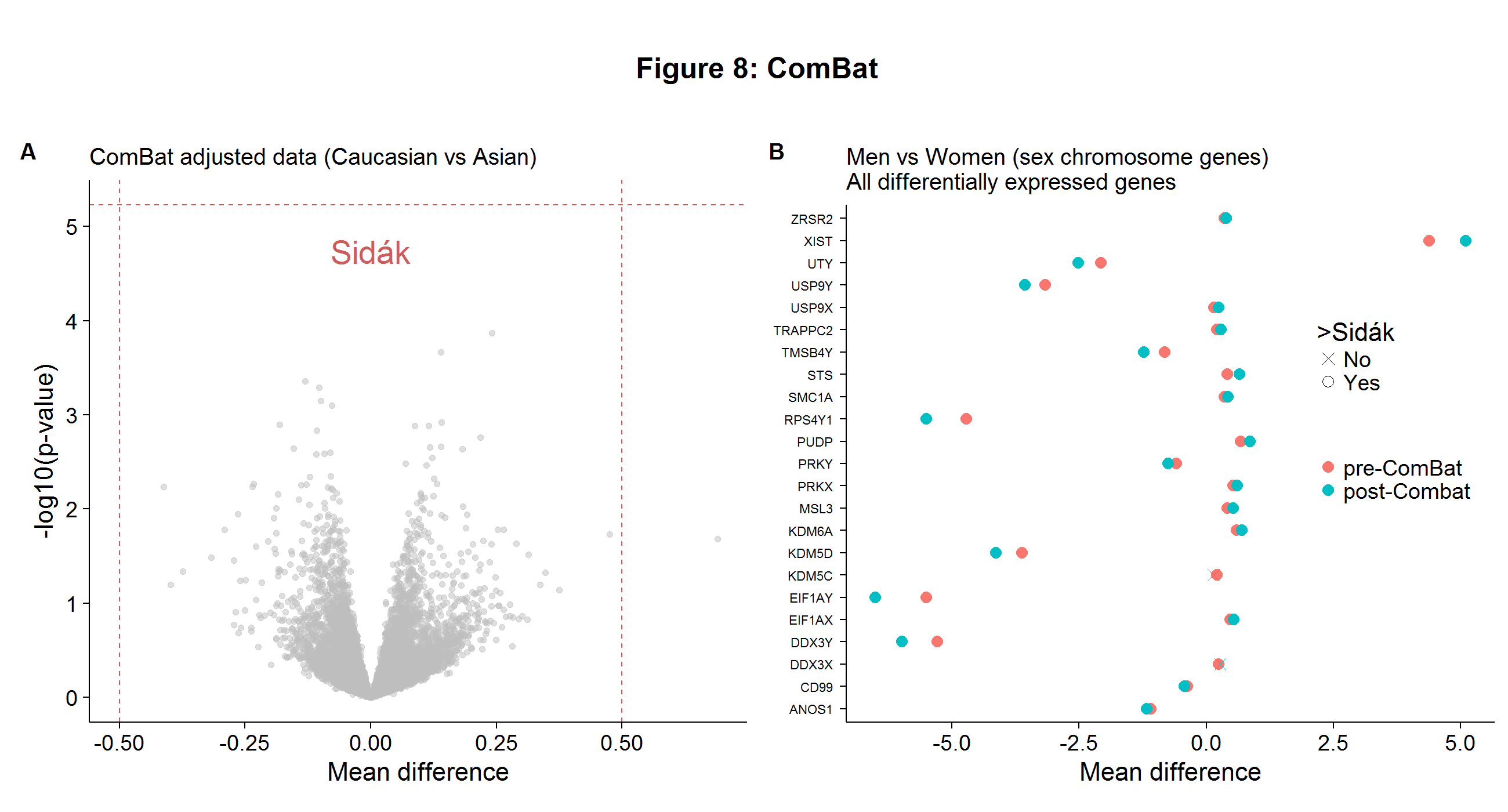
combat.tt <- rowttests(combat_edata,ethnicity2)After repeating the gene-wise t-tests with the ComBat-adjusted data, there are now no differentially expressed genes between the two ethnic groups, as Figure 8A shows below. This finding casts doubt on the Spielman paper, but is unsurprising as we have seen evidence of batch effects throughout this analysis and the problems with this paper have been noted previously! Even though ComBat is considered one of the best adjustment procedures, its implementation will inevitably scramble some of true biological signals found in the data. However, the loss of information is likely to be small. In Figure 8B I show that even after applying the ComBat procedure, there were roughly the same number of differentially expressed genes found on the sex chromosome between the genders.[4]
I hope this summary of batch effects has been useful! Links to the R and Python code needed to replicate the analysis and figures can be found on my GitHub page here. To paraphrase Smokey the Bear:
You've been warned!

-
I have provided my best interpretation of the underlying biology, but as my background is in economics/statistics, a trained in biology would likely employ a more accurate syntax. ↩
-
When the colored hybridization sites (as shown in Figure 1) are numerically represented, they form a column of expression values in the DNA microarray data sets (as shown in the columns of Figure 2A). ↩
-
The t-test has a \(-\log_{10}\) p-value above the Sidak cutoff and the two groups have a difference in absolute mean difference greater than 0.5. ↩
-
Which we know represents a source of true biological variation. ↩