Introduction to R and Bioconductor
This post was created for students taking CISC 875 (Bioinformatics) and has two goals: (1) introduce the R programming language, and (2) demonstrate how to use some of the important Bioconductor packages for the analysis of gene expression datasets. R has become the dominant programming language for statistical computing in many scientific fields due to its open-source nature and extensive ecosystem of packages developed by other users. While most packages are stored on CRAN, packages specifically designed for biology, bioinformatics, and related areas are stored on Bioconductor. In other words, the collection of biologically-related R packages are said to be Bioconductor packages.
To install packages from the default CRAN repository, one can use the install.packages() function. To query more details about any function in R, you can type ?somefunction in your command line such as ?install.packages. In the code block labelled “STEP 0” below I set up a list of Bioconductor and CRAN packages to install on your system if they haven’t been already. The function biocLite is the Bioconductor equivilant of install.packages - and it also prompts the version updates of any old packages. I load three Bioconductor packages in the code below: GEOquery, genefilter, and hgu133plus2.db. All of these packages contain dependencies (other packages they need in order to work), and these should be automatically installed at the same time. If a package ever has an error when your try to load it with the library function, check the error output as it may involve some missing packages which need to be installed.
When reading the code throughout this tutorial, if any function or command is unclear, I strongly recommend querying it with ?. Additionally, you will notice the %>% operator in this tutorial. This is a pipe operator, and it is part of the magrittr packages. Piping allows code to be written in the same way that an English sentence is constructed: from left to right. A pipe passes the object on the left-hand side of %>% into the first argument position of the function on the right-hand side of the piping operator. So iris %>% head(n=3) is the same as head(iris,n=3). Even if you are new to R, the following code should be fairly intuitive: 1:10 %>% mod(2) %>% equals(0) %>% which, which reads like it looks: “generate a sequence of numbers from 1 to 10 THEN apply modulo 2 to each THEN test if each element is equal to zero THEN tell me which of these is true”. In other words, find all the even numbers. In contrast, to write the same statement without pipes: which(mod(1:10,2)==0), which is more compact, in this instance, but clearly less readable.
Quite a few functions in this tutorial also take advantage of tidyverse packages such as tidyr and ggplot2. You will see functions like mutate (create a new column), filter (subset rows by a logical condition), and gather (put data into long format). It is worth understanding the difference between wide and long formats of data, the latter being necessary for advanced plotting functions such as ggplot. Below is an example of a wide data set, where variables with numeric expressions are given their own columns.
head(iris,3)## Sepal.Length Sepal.Width Petal.Length Petal.Width Species
## 1 5.1 3.5 1.4 0.2 setosa
## 2 4.9 3.0 1.4 0.2 setosa
## 3 4.7 3.2 1.3 0.2 setosaIf instead we want to collapse this data set to matching key-value pairs, i.e. a long-format dataset, we can use the following gather command (note that we don’t want to collapse the Species column as we want it to match a numeric expression).
long.form <- gather(data=iris,key=measurement_type,value=measurement_value,-Species)
long.form %>% head(3)
## Species measurement_type measurement_value
## 1 setosa Sepal.Length 5.1
## 2 setosa Sepal.Length 4.9
## 3 setosa Sepal.Length 4.7Long format data also has the advantage that it is much easier to query key-pair values. For example, I can ask which species has the largest measurement for each measurement type (clearly virginica flowers for most):
long.form %>% group_by(measurement_type) %>%
  filter(measurement_value==max(measurement_value)) %>% head(4)
## Source: local data frame [4 x 3]
## Groups: measurement_type [4]
##
## Species measurement_type measurement_value
## <fctr> <chr> <dbl>
## 1 virginica Sepal.Length 7.9
## 2 setosa Sepal.Width 4.4
## 3 virginica Petal.Length 6.9
## 4 virginica Petal.Width 2.5On with the tutorial!
######################################################
######## ----- STEP 0: PRELIMININARIES ------ ########
######################################################

# Limits printing output
options(max.print = 100)
# Get all your currently installed packages
ip <- rownames(installed.packages())
# Will allow us to download Bioconductor packages
source("https://bioconductor.org/biocLite.R")
# Will install the base Bioconductor packages:
# Biobase, IRanges, AnnotationDbi
biocLite()

# Install these extra Bioconductor packages
lb <- c('GEOquery','genefilter','hgu133plus2.db')
for (k in lb) {
  if(k %in% ip) { library(k,character.only=T)}
  else { biocLite(k); library(k,character.only=T) }
}

# Load in CRAN packages
ll <- c('tidyverse','magrittr','forcats','stringr','cowplot',
        'broom','scales','reshape2','ggrepel')
for (k in ll) {
  if(k %in% ip) { library(k,character.only=T)}
  else { install.packages(k); library(k,character.only = T) }
}
# Set up directory (ENTER YOUR DIRECTORY HERE)
setwd('C:/.../')Part 1: Loading in microarray datasets from GEO
Most published academic research related to “microarray, next-generation sequencing, and other forms of high-throughput functional genomic datasets” are uploaded to the Gene Expression Omnibus (GEO). This means that you can download data from interesting research to do your own analysis or replicate results. To find a data set for this tutorial, I just searched HER2 as a keyword and found the following data set which contains:
Analysis of FFPE core biopsies from pre-treated patients with HER2+ breast cancer (BC) randomized to receive neoadjuvant chemotherapy only or chemotherapy+trastuzumab (herceptin). Results provide insight into the molecular basis of survival outcomes following trastuzumab-based chemotherapy.
The summary page tells us that it is “DataSet Record GDS5027” and it used the “Affymetrix Human Genome U133 Plus 2.0 Array” platform. The first step is to download the GDS5027 dataset using the getGEO function from the GEOquery library we loaded in during STEP 0. Another thing to note: if you see to colons such as GEOquery::getGEO, I write this deliberately to point out which library this function comes from, with the general notation being somelibrary::somefunction(arguments). It will take a minute or so to download the data to your folder and then load it into R.
##############################################################
######## ----- STEP 1: LOAD IN THE GEO DATASET ------ ########
##############################################################

# Download the data to our folder (will take a bit)
GEOquery::getGEO(GEO='GDS5027',destdir=getwd())
# Load the data (again will take a bit)
gds5027 <- GEOquery::getGEO(filename = 'GDS5027.soft.gz')
You can then use the Meta or Table functions to look at some of the propeties of this GDS-class object we called gds5027.
# --- Print the meta information --- #
Meta(gds5027)$description[1]
Meta(gds5027)$sample_count
# The columns of our expression data are the samples (i.e. people)
colnames(Table(gds5027)) %>% head(5)
# Each row contains expression values for a given gene
Table(gds5027)[,1:5] %>% head(5)
Table(gds5027)[,1:5] %>% tail(5)
Next we will want to convert the GDS object into an ExpressionSet object, which is the object type that Bioconductor packages are built around when dealing with micorarray expression data.
# Turn the GDS object into an expression set object (the workhorse of the Biobase package)
eset <- GEOquery::GDS2eSet(gds5027)
This next step is extemely important as we are going to extract the phenotype data with the phenoData function and the gene level expression data with the exprs function, as well as dropping any affymetrix control probes.
pData <- Biobase::phenoData(eset)@data %>% tbl_df
eData <- affy::exprs(eset)
# Re-label the long strings: control=cyclophosphamide/methotrexate/fluorouracil
pData <- pData %>%
  mutate(protocol=factor(protocol,levels=levels(protocol),labels=c('Control','Trastuzumab')),
                 other=factor(other,levels=levels(other),labels=c('Remission','Residual Disease'))) %>%
          dplyr::select(-description)
# Next, for the expression data, we'll need to remove the affymetrix controls
affx <- Table(gds5027)$ID_REF %>% grep('AFFX',.)
eData <- eData[-affx,] # Drops these indices
Part 2: Getting annotation data
As was discussed in our second lecture, getting annotation data is essential for genomic analysis. To get additional information on the genes contained in this dataset, we will use the Affymetrix probe names (contained as the row names of the eData object) and use the hgu133plus2.db Bioconductor package, as we know this was our microarray platform. Several functions from Bioconductor packages allow for the translation of the Affymetrix/Illumina gene ID codes into genomic information such as chromosome location or the common gene symbol name.
In the code below we use: mapIds(hgu133plus2.db,keys=probe.ids,column='SYMBOL',keytype='PROBEID',multiVals='first'), which does the following: “look up our supplied probe ids in the PROBEID column and return the associated gene symbol from the hgu133plus2 annotation database”. I also write some lines of code that will get the chromosome location information and drop duplicate probes. After doing this, it may be worth while to save the data so that you can load it from this point onwards and not have to repeat these steps.
###############################################################
######## ----- STEP 2: GET THE ANNONTATION DATA ------ ########
###############################################################

# get affymetrix probe id names
probe.ids <- rownames(eData)
# IDs to Chromosome location, options: columns(hgu133plus2.db)
annot.df <- tibble(probes=probe.ids,
                   symbols=AnnotationDbi::mapIds(hgu133plus2.db,keys=probe.ids,
                                                  column='SYMBOL',keytype='PROBEID',multiVals='first'),
                   map=AnnotationDbi::mapIds(hgu133plus2.db,keys=probe.ids,
                                                 column='MAP',keytype='PROBEID',multiVals='first'))
# Some of the observations don't have a chromosome location, so we'll drop them after
annot.df$chr <- annot.df$map %>% str_split_fixed('p|q',2) %>% extract(,1) %>% gsub('cen-','',.)
annot.df <- annot.df %>% filter(chr!='') %>% dplyr::select(-map)

# Get Chromosome location annotation data (a little more work)
x <- hgu133plus2CHRLOC
# Get the probe identifiers that are mapped to chromosome locations
mapped.probes <- mappedkeys(x)
# Convert to a list
xx <- as.list(x[mapped.probes])
match.probes <- which(names(xx) %in% annot.df$probes)
annot.df <- annot.df %>% filter(probes %in% names(xx[match.probes]))
annot.df$loc <- lapply(xx[match.probes],'[[',1) %>% as.numeric %>% abs
# Drop any duplicated values
annot.df <- annot.df[-which(duplicated(annot.df[,-1])),]
# make sure expression data lines up
eData <- eData[which(probe.ids %in% annot.df$probes),]
# Save data for later
save(annot.df,pData,eData,file='step2.RData')
Let’s look at the data we have created. We see that annot.df contains the probe and HGNC human gene names along with the associated chromosome location, pData gives up information related to each person (sample) such as whether they received the Trastuzumab drug treatment, and eData which is a 19149 x 156 matrix with each row being the expression values for a given gene.
# print some famous genes
annot.df %>% filter(grepl('BRCA|ERBB',symbols))
## # A tibble: 5 × 4
## probes symbols chr loc
## <chr> <chr> <chr> <dbl>
## 1 1563252_at ERBB3 12 56080107
## 2 204531_s_at BRCA1 17 43044294
## 3 206794_at ERBB4 2 211375716
## 4 208368_s_at BRCA2 13 32315479
## 5 210930_s_at ERBB2 17 39699977# phenotype-related ata
pData[1:4,]## # A tibble: 4 × 4
## sample `genotype/variation` protocol other
## <fctr> <fctr> <fctr> <fctr>
## 1 GSM1232995 HER2+ Control Remission
## 2 GSM1233002 HER2+ Control Remission
## 3 GSM1233003 HER2+ Control Remission
## 4 GSM1233014 HER2+ Control Remission# Expression data
eData[1:4,1:4]## GSM1232995 GSM1233002 GSM1233003 GSM1233014
## 1053_at 1.67386 1.85564 1.93680 1.84245
## 117_at 4.69654 5.39690 5.31650 6.12429
## 121_at 4.65362 5.37736 5.94853 5.19379
## 1255_g_at 1.96857 2.35840 2.11201 2.24903Part 3: Making cool charts!
First let us look at the remission rates contained in the phenotype data and see how they vary by the different groups. We will use the ggplot function throughout the rest of this tutorial to make graphs. I would recommend glancing at the ggplot2 bible or other tutorials to get a feel of what ggplot can do. The plots are basically built with layers, so: ggplot(...) + geom_point(...) + ggtitle(...) is saying “make a plot with this data THEN add some points THEN add a title”. The chart below suggests that patients which received the control treatment had a low remission rate, regardless of HER status, whereas HER+ patients that received Trastuzumab did much better.
Barplots
# Relative survial rates by the different types
surv.share <- pData %>% group_by(`genotype/variation`,protocol,other) %>% count %>%
  rename(genotype=`genotype/variation`) %>% mutate(share=n/sum(n),type=paste(protocol,genotype,sep='-'))
# Make a ggplot
gg.surv.share <- ggplot(surv.share,aes(x=type,y=share*100)) +
  coord_flip() +
  geom_bar(stat='identity',aes(fill=other),color='black',position=position_dodge()) +
  scale_fill_discrete(name='') +
  scale_y_continuous(breaks=seq(0,80,20),labels=str_c(seq(0,80,20),'%')) +
  labs(subtitle='Clinical outcome share') +
  theme(legend.position='bottom',axis.title.y = element_blank(),
        axis.ticks.y = element_blank(),axis.title.x = element_blank())
# Plot it
gg.surv.share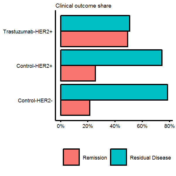
As Trastuzumab is designed to treat breast cancer which is HER2 receptor positive, it would worthwhile to see if we can figure out how the HER2 positive label was generated. The HGNC symbol for HER2 is ERBB2. We will query our annotation data, find which probes have a symbol name matching “ERBB”, and then plot the distribution of normalized expression values, coloured by whether the phenotype data says they are HER2+/HER2-. The plot below does indeed show that HER2+ patients have higher than average expression at the the ERBB2 probe site.
Density plots
# Find the ERBB genes and normalize
erbb.probes <- annot.df %>% filter(grepl('ERBB',symbols))
erbb.dat <- data.frame(symbols=erbb.probes$symbols,eData[which(probe.ids %in% erbb.probes$probes),]) %>%
  gather(patient,expr,-symbols) %>% tbl_df %>% group_by(symbols) %>% mutate(expr=scale(expr)) %>%
  left_join(pData %>% transmute(patient=sample,status=`genotype/variation`),by='patient')
# Plot it
gg.her2 <- ggplot(erbb.dat,aes(x=expr,fill=status)) +
              geom_density(alpha=0.5,color='black') +
              facet_wrap(~symbols) +
              labs(x='(Normalized) expression',y='Density') +
              theme(legend.position='bottom') +
              scale_fill_discrete(name='Status: ')
gg.her2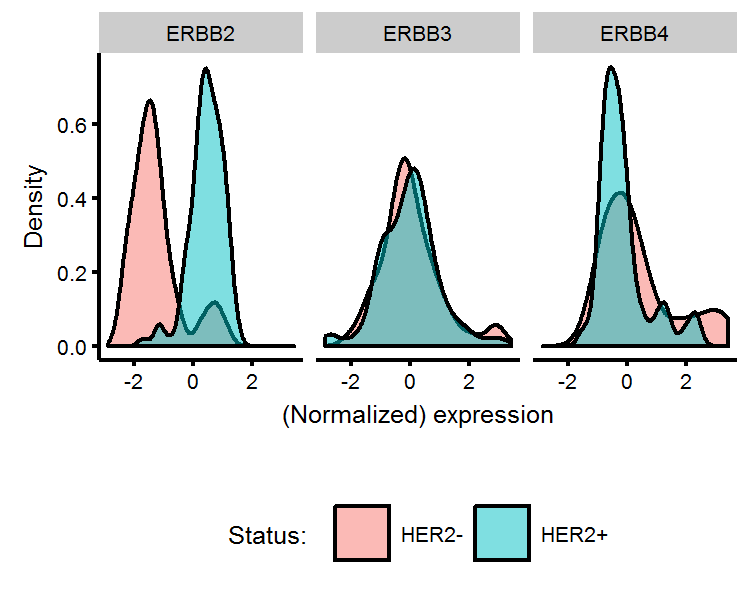
Biologists may also be interested in whether HER2+/HER2- patients have other genes which are differentially expressed (in addition to ERBB2). To test this, we can perform a t-test on every gene comparing the mean between the two HER2 status groups. T-tests consider whether the differences in the mean of two groups is likely to arrise from chance alone. A p-value provides a quantitative answer to this question, and can be interpreted as the “the probability of seeing this realization of the data from chance alone, assuming the two groups have the same mean”. Thus, if we see a p-value of 1%, this is saying that were the two groups to have identical means, this realization of the data would be observed 1 out of 100 times and therefore the assumption of mean equality is quite unlikely. Usually a threshold of either 1% or 5% is imposed, and genes which have a lower p-value than this are assumed to be differentially expressed.
As we have more than 19K genes, we will get back more than 19K p-values. This introduces the problem of multiple hypothesis testing, and therefore requires us to modify how we interpret our p-values. Correction procedures, such as the Bonferroni method can be employed. With a 5% threshold, we will now require a p-value to be less than \(0.05/19149\) for us to reject the null. We often do a log-transformation of the new theshold value \(-\log_{10}(0.05/19149)\)=5.6 for easier visualization.
After getting the associated t-statistic p-value and mean difference using the genefilter::rowttests function, we will plot the difference in means on the horizontal axis and the -log10 p-value on the vertical-axis. We see that 34 out of the 19K plus genes are differentially expressed between HER+/HER- patients, and we add text annotations on the plot to the genes with the highest expression differences (with ERBB2 unsurprisingly having the largest). These sorts of plots are known as Volcano plots in genomic analysis.
Volcano plots
# Bonferroni correction
bonferroni <- -log10(0.05/nrow(annot.df))
# Find the differentially expression genes between HER2+/HER2-
ttest1 <- cbind(annot.df,genefilter::rowttests(eData,fac=pData$`genotype/variation`)) %>% tbl_df %>%
            mutate(log10p=-log10(p.value),bonfer=ifelse(log10p>bonferroni,'Above','Below'))
# Get the annotation symbols to plot
ttest.bonfer <- ttest1 %>% filter(bonfer=='Above') %>% arrange(desc(log10p))
# There are 34 genes differentially expressed between HER+/HER-
gg.volcano <-
  ggplot(data=ttest1,aes(x=dm,y=log10p,color=bonfer)) +
  geom_point(alpha=0.5,show.legend=F) +
  scale_color_manual(name='',values=c('indianred','grey')) +
  labs(x='Mean difference',y='-log10(p-value)') +
  geom_hline(yintercept=bonferroni,color='indianred',linetype=2) +
  geom_text_repel(data=ttest.bonfer[1:10,],aes(label=symbols),color='indianred',size=4,nudge_y = 5)
gg.volcano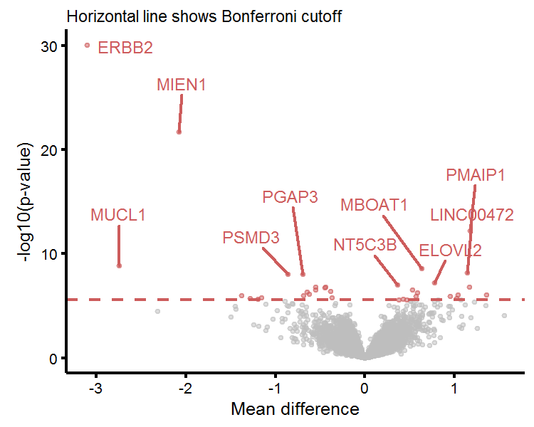
To get an intuitive understanding of what the t-test is measuring, we will plot the four genes with the largest mean difference in expression below. We see that the mean expression of ERBB2, MIEN1, MUCL1, and PMAIP1 between HER2+/HER2- labelled patients are (likely) just too far apart to be due to chance alone. The t-test only uses the number of observations, mean, and standard error from both groups in order to generate a p-value.
Visualizing the t-test
# Make a chart of the four highest expressing genes
top.four <- ttest.bonfer$symbols[1:4]
top.four.df <- cbind(symbols=top.four,eData[which(annot.df$symbols %in% top.four),]) %>% tbl_df %>%
  gather(sample,val,-symbols) %>% left_join(pData[,c(1,2)],by='sample') %>%
  rename(genotype=`genotype/variation`) %>% mutate(val=as.numeric(val))
# Calculate the means of each
top.four.moments <- top.four.df %>% group_by(symbols,genotype) %>%
  summarise(avg_expr=mean(val),se_expr=sd(val))
# plot it
gg.topfour <-
ggplot(top.four.df,aes(x=genotype,y=val,color=genotype)) +
  geom_jitter(show.legend=F) +
  labs(y='Expression',subtitle='Mean and SE shown in black') +
  facet_wrap(~symbols,scales='free_y') +
  theme(axis.title.x=element_blank()) +
  geom_point(data=top.four.moments,aes(y=avg_expr,x=genotype),inherit.aes=F,color='black',size=2) +
  geom_linerange(data=top.four.moments,aes(ymin=avg_expr-se_expr,ymax=avg_expr+se_expr,x=genotype),
                 inherit.aes=F,color='black',size=1)
gg.topfour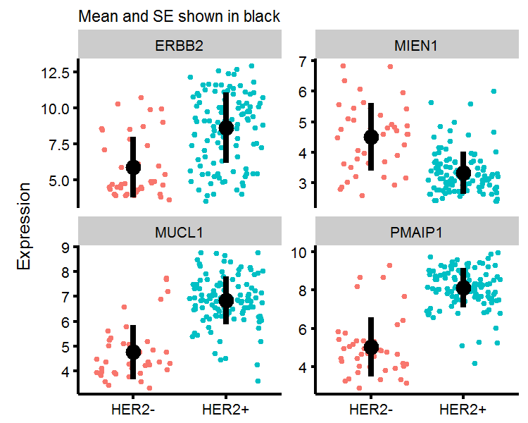
Another way to visualize the HER2+/HER2- genotypes is to use multidimensional scaling techniques (MDS) to represent high-dimensional data on a 2-dimensional plane, where the distance between points on two-dimensions “approximates” the distance between points in higher dimensional space. We will plot whether the distances between the genomic expression of the 34 genes we identified naturally “cluster” in the HER2+/HER2- genotypes. To carry this out in R, we will use the dist function to calculate the Euclidian distance between points (where there are 156 points (number of patients), each of which is in \(\mathbb{R}^{34}\)), and then use the cmdscale function to perform classical MDS. In my plot, I turn off the horizontal/vertical axis values, as all that matters in MDS is the relative distance between points, and not the scale of the axis. We see that were we to assign a given genomic expression profile to one of two groups using the k-means clustering algorithm, the 2-dimensional representation of data would correctly identify most of the HER2+/HER2- patients.
Multidimensional scaling plots
# Calculates euclidian distance each point
similarity <- dist(scale(t(eData[which(annot.df$symbols %in% ttest.bonfer$symbols),])))
mds1 <- cmdscale(similarity,eig=FALSE, k=2)
# Put into data.frame
mds1.df <- data.frame(mds1) %>% mutate(sample=rownames(.)) %>% tbl_df %>%
  left_join(pData[,c('sample','genotype/variation')],'sample') %>%
  mutate(kmeans=fitted(kmeans(mds1.df[,1:2],centers=2),method='classes') %>% factor)
# Plot
gg.mds <-
  ggplot(mds1.df,aes(x=X1,y=X2)) +
  geom_point(size=5,aes(shape=`genotype/variation`,color=kmeans)) +
  theme(axis.title=element_blank(),axis.text=element_blank(),
        axis.ticks=element_blank(),legend.direction='horizontal',legend.position='bottom') +
  scale_color_discrete(name='',labels=c('Group 1','Group 2')) +
  scale_shape_manual(name='HER2 Status:',values=c('+','-'),labels=c('','')) +
  labs(subtitle='MDS scaling, k-means, and actual status')
gg.mds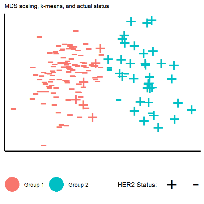
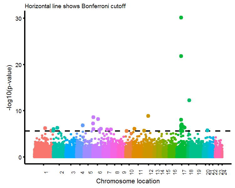
The last plot we will produce will be a Manhattan plot, where the horizontal-axis is organized by choromosome position and the vertical axis contains the associated p-values of gene-wise t-tests (just like the Volcano plot).
Manhattan plots
# Get the chromosome data, replace X/Y with 23/24
manhatt.dat <- ttest1 %>% dplyr::select(chr,loc,log10p) %>%
  mutate(chr2=factor(chr,levels=c(1:22,'X','Y'),labels=1:24)) %>%
  arrange(chr2,loc) %>% mutate(loc2=1:length(loc)) %>%
  group_by(chr2) %>% mutate(loc3=1:length(loc))
# Get average location value for chromosome labels
chr.label <- manhatt.dat %>% group_by(chr2) %>% summarise(pos=round(mean(loc2)))
# Get subset for plotting significant points
manhatt.sub <- manhatt.dat %>% filter(log10p>bonferroni)
# Plot
gg.manhatt <- ggplot(manhatt.dat,aes(x=loc2,y=log10p,color=chr)) +
  geom_point(size=0.5,show.legend=F) +
  scale_x_continuous(limits=c(1,19149),breaks=chr.label$pos,labels=chr.label$chr2) +
  labs(x='Chromosome location',y='-log10(p-value)',subtitle='Horizontal line shows Bonferroni cutoff') +
  geom_hline(yintercept=bonferroni,color='black',linetype=2) +
  geom_point(data=manhatt.sub,size=2,show.legend = F) +
  theme(axis.text.x=element_text(size=9,angle=90))
gg.manhatt