An analysis of neighbourhood level population changes in Toronto and Vancouver
I recently reviewed House Divided, a book which discusses the regulatory reasons behind the “missing” low- to medium-density housing structures that are absent in Toronto. The problem of regulatory constraints is not a Toronto-specific problem. A virtually identical problem exists in Vancouver. The political economy of Toronto and Vancouver has settled into an equilibrium that is acceptable to wealthy private landholders and developers: high-rise development will occur on a tiny percentage of the land, with the majority of residential land preserving its historic “character”.
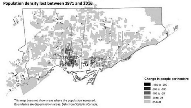
While reading this book I noticed a fascinating figure from Dr. Anna Kramer’s chapter “Inside and Outside: A Meditation on the Yellowbelt”, which showed that a significant portion of Toronto’s neighbourhoods have actually lost population since 1971. This is consistent with the Yellowbelt Hypothesis: zoning regulations which prevent natural densification lead to a population decline in neighbourhoods where household sizes shrink naturally overtime (e.g. the children move out, the grandparents pass away).
Figure 1: Whither Toronto's density?
Disturbed and intrigued by Kramer’s figure above, I reached out to learn more about the data. I was pleasantly surprised when Dr. Kramer said she would be able to share the data with me that she had used to generate this figure. In this rest of this post I will dive into this dataset which contains population level information at the neighbourhood level. Numerous figures and summary statistics will shed light onto how populations have changed within the Toronto and Vancouver Census Metropolitan Areas (CMAs). I had similar set of questions I wanted to ask for both CMAs, and therefore my analysis is less of a comparison study and more akin to exploratory data analysis.
The CMA refers to the collection of municipalities centred around a city. For example Surrey is part of the Vancouver CMA, even though it is not part of the City of Vancouver. Census subdivisions (CSDs) are StatsCan’s geographic unit that aligns with municipalities most Canadians are familiar with: Vancouver, Coquitlam, New Westminster, etc. The results of this analysis are consistent with the hypothesis that supply-side constraints lead to an inefficient and socially costly distribution of the population within two of Canada’s most important cities.
Terminology and data sources
The population data is measured at the unit of a dissemination area (DA). DAs are the smallest geographical unit of measurement that Statistics Canada (StatsCan) releases to the public. The mean and median DA was 0.13 and 0.85 square kilometres, respectively, in this dataset. Unless capitalized, “neighbourhood” will refer to a DA. Unless otherwise noted, “Toronto” and “Vancouver” refer to the CMA, whereas the “City of Toronto” refers to the city within the CMA.
“Net density” refers to population increases or decreases that have occurred since the formation of the DA. For example, if DA #12345 was first formed in 1981 with 500 individuals, and had 1100 individuals in 2016, its net density calculation would be 600 over this period.
“Net DAs” refers to the population change attributable by the creation of new DAs, or the dissolution of existing DAs. Returning to the previous example, in 1981, when DA #12345 was first created, it would have a net density change of 0, but a net DA change of 500.
The primary source of data was the DA-level data from the census provided by Dr. Kramer. I also made use Census 2016 DA data, cartographic boundary files for plotting purposes, a useful map of Toronto and its neighbourhoods, as well as information on a mapping between DAs and census subdivisions.
Lastly, I want to stress the limitations of this analysis. First, due to adjustments made to the DAs by StatsCan to make them comparable over time, there is measurement error in some of my analyses. This means that the aggregated values of the DAs in a given census subdivision, or median income in that DA will be noisy. After doing some visual spot checks, I am confident that the aggregate errors are likely to be small. Second, because this analysis is necessarily exploratory, I have almost completely avoided using “p-values” or formal statistics (except in one table) as these methods only make sense in a highly proscribed and pre-specified environment.
Unlike my other posts, I’m not going to show the code needed to recreate this analysis for two reasons. First, most of the code is fairly uninformative and is largely data processing and transformation. Second, I cannot easily upload the datasets needed to recapitulate the results. However, if you are interested in getting access to the data contact either myself or Dr. Kramer. For those who are interested in the code, the github repo used to generate these results can be found here. As a final note, I was impressed by the state of support for geographical analysis in R, particularly the sf package and its seamless interaction with the tidyverse and ggplot environments.
Executive summary
Because this post contains seventeen figures and numerous technical discussions, I have distilled the salient facts which emerge from the analysis. Despite the impressive gains in population in these two cities overall, the distribution and composition of neighbourhood growth in the Toronto and Vancouver CMAs is skewed and limited to a handful of areas. The clear spatial and geographical concentration of population increases points to obvious regulatory constraints preventing densification on the majority of residential land.
- Over a 45 year period, 1971-2016, 56 of Toronto’s 140 Official Neighbourhoods had smaller populations in 2016 than they did in 1971 (e.g. The Annex). More than 70% of Neighbourhoods in what was formerly Old Toronto, fall into this category of de-densification. 80% of the City of Toronto’s population growth have come from 20 Neighbourhoods.
- The Toronto and Vancouver CMAs have seen their population more than double since 1971, outpacing national growth, and adding 3.2 and 1.4 million individuals, respectively.
- The City of Surrey accounts for the plurality of growth in the Vancouver CMA (31%). Growth is more balanced between the City of Toronto and the other municipalities that make up the Toronto CMA.
- Two-thirds of the Toronto CMA’s population growth has come from the creation of new DAs, and only one-third of population growth has come from increasing density of existing DAs. In the Vancouver CMA, the figures are reversed: two-thirds of the population gains have come from increased densities in existing DAs.
- Since the 2011 census, very little population growth has come from new DA formation.[1]
- Toronto’s oldest DAs have shown very little densification, whereas DAs formed after 1971 have been more likely to record higher densities over time.
- Roughly the same number of DAs lose population compared to those that gain. De-densifying DAs lose an average of 250K and 125K individuals between census years in the Toronto and Vancouver CMA, respectively. However, the net gains from density to each CMA end up being positive as the DAs that see population growth increase by a larger magnitude than those that see population declines.
- There is a clear spatial correlation for those areas that have seen population density increase or decrease. Population growth has been concentrated into a fraction of residential areas.
- Statistical evidences suggests that having a higher share of row housing units is associated with higher population growth (the “missing middle” hypothesis), whereas higher incomes and single-family and semi-detached homes are associated with a declining population over time (the NIMBY hypothesis).
(1) Data overview
The Kramer dataset contains 9 censuses, starting in 1971 and going to 2016, with the census occurring every fifth year, except for 1976, which is unavailable. Each file contains the aggregate population for the Toronto and Vancouver CMAs. For example, in 2016 the Toronto CMA was around 5.9 million individuals, with the City of Toronto accounting for a little less than half of this number.[2] The other cities in the Toronto CMA that have a population exceeding 300K are Mississauga, Brampton, Markham, and Vaughan. This first section will analyse the key challenges and considerations that were used when analysing the data.
There are a total of 7516 and 3440 unique DAs over all census years for the Toronto and Vancouver CMAs, respectively. While any DAs found between census years in this dataset are consistent in the sense that they correspond to the same geographic boundary, many DAs are unavailable (i.e. missing), for earlier census years because they did not exist at the time.
Figure 2: Number of DAs by census year
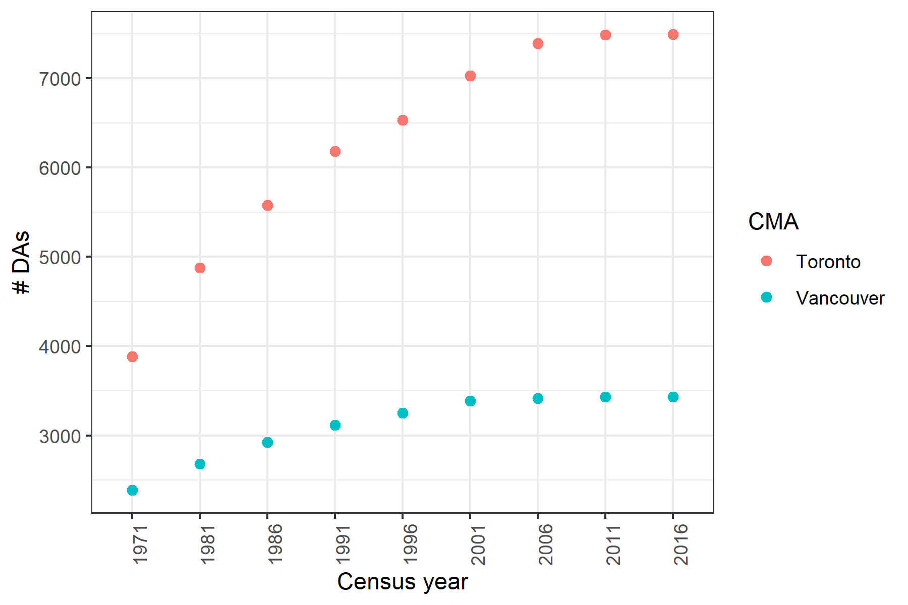
Figure 2 shows that the number of DAs roughly doubled from 1971 to 2016 in the Vancouver and Toronto CMAs. The main reason for this is that the amount of residential and inhabited land in these cities has been growing over time. As development pressure has increased, industrial parks have been converted into condos and greenfield sites have been turned in residential communities.
Figure 3: Churn in DA formation
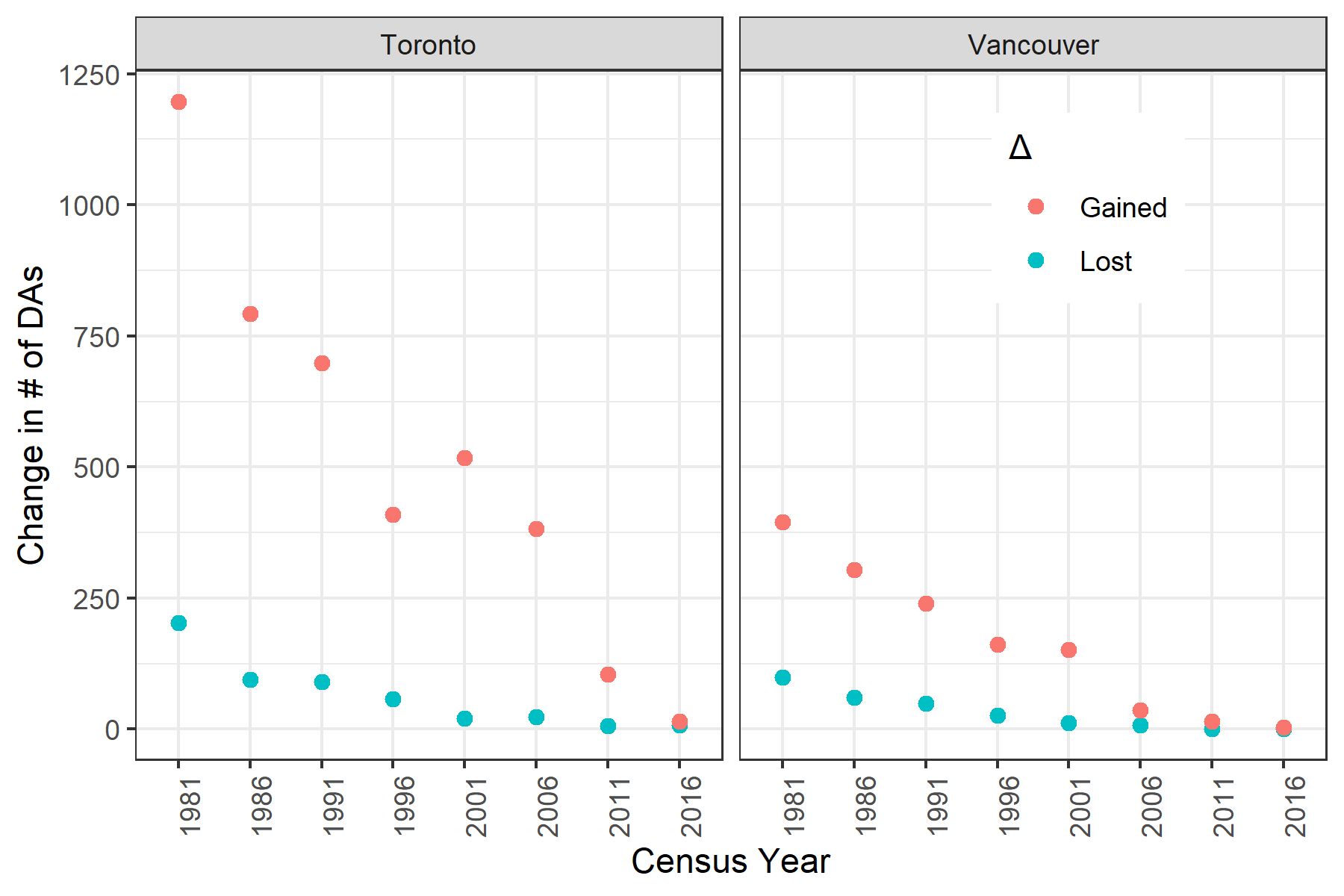
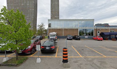
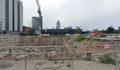
DAs can also be “lost” between census years if that area is redeveloped to a non-residential purpose. However, for most of the past 45 years, the ratio of newly created DAs to lost DAs is at least 5:1 as Figure 3 shows. The large increase in neighbourhood formation in Toronto and Vancouver effectively ended in the 2001-2011 period. What are some of examples of DAs that no longer exist? I spot checked the few cases (8) of DAs that no longer had population between the 2011 and 2016 census using Google maps. In one instance the area had become a parking lot and associated commercial buildings. In another, it was a sprawling mall complex (that had grown I presume), and in the third case, a new area of construction in Regent Park.[3]
Figure 4: No one lives here anymore...
 |
 |
 |
To better understand the overlap in neighbourhoods over time, the pairwise similarity of DAs between census years can be calculated using the Jaccard Index, which is the ratio of the intersection over the union.
Figure 5: Jaccard similarity between censuses
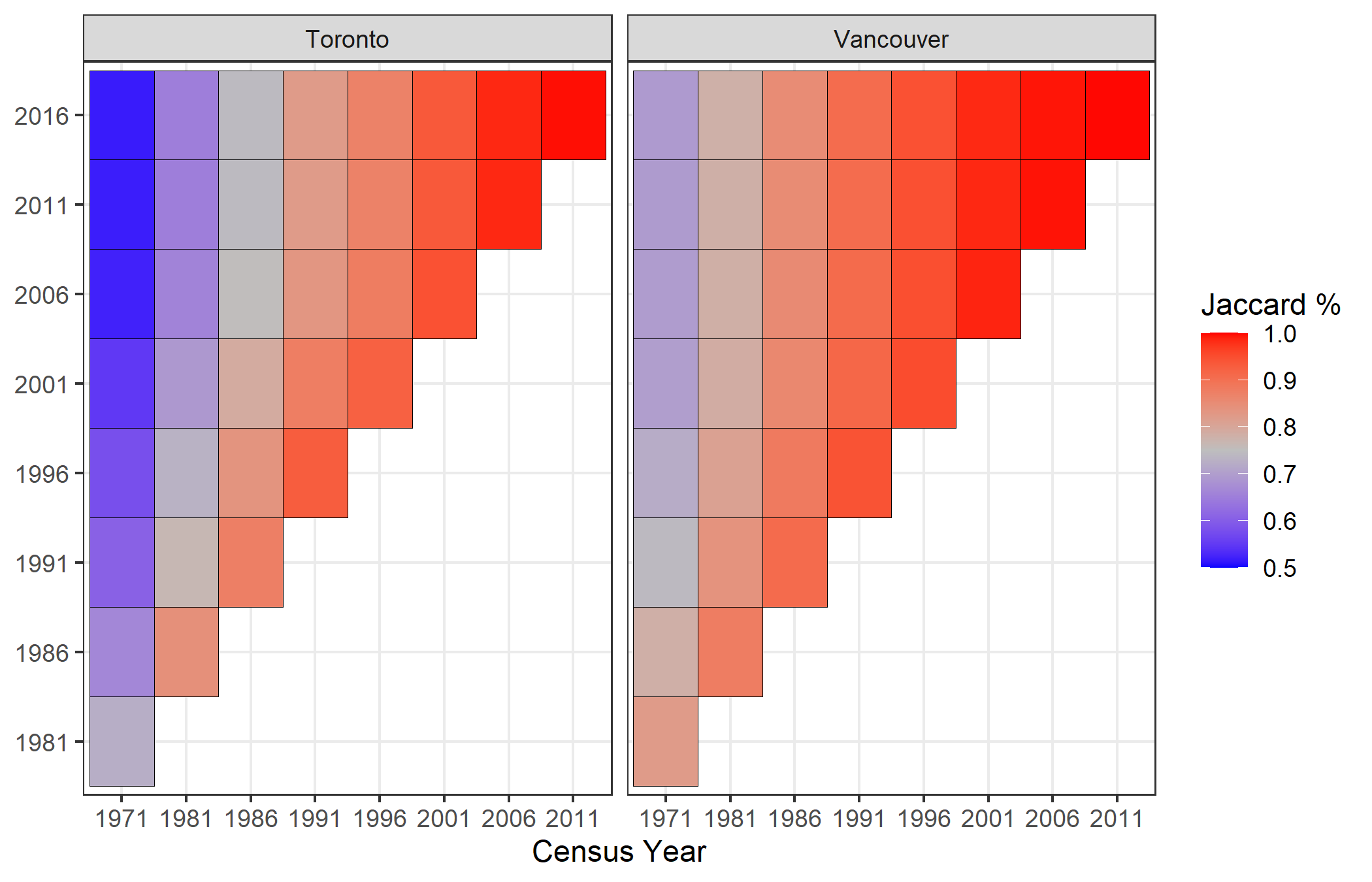
With the addition of so many DAs over time in both CMAs, the earlier census years are only comparable for around 60-80% of neighbourhoods. One final data issue to note is that there is a discrepancy between the aggregate census count of the CMA and the population total over all DAs, especially for the early census years.
Figure 6: Data discrepancies in total population count
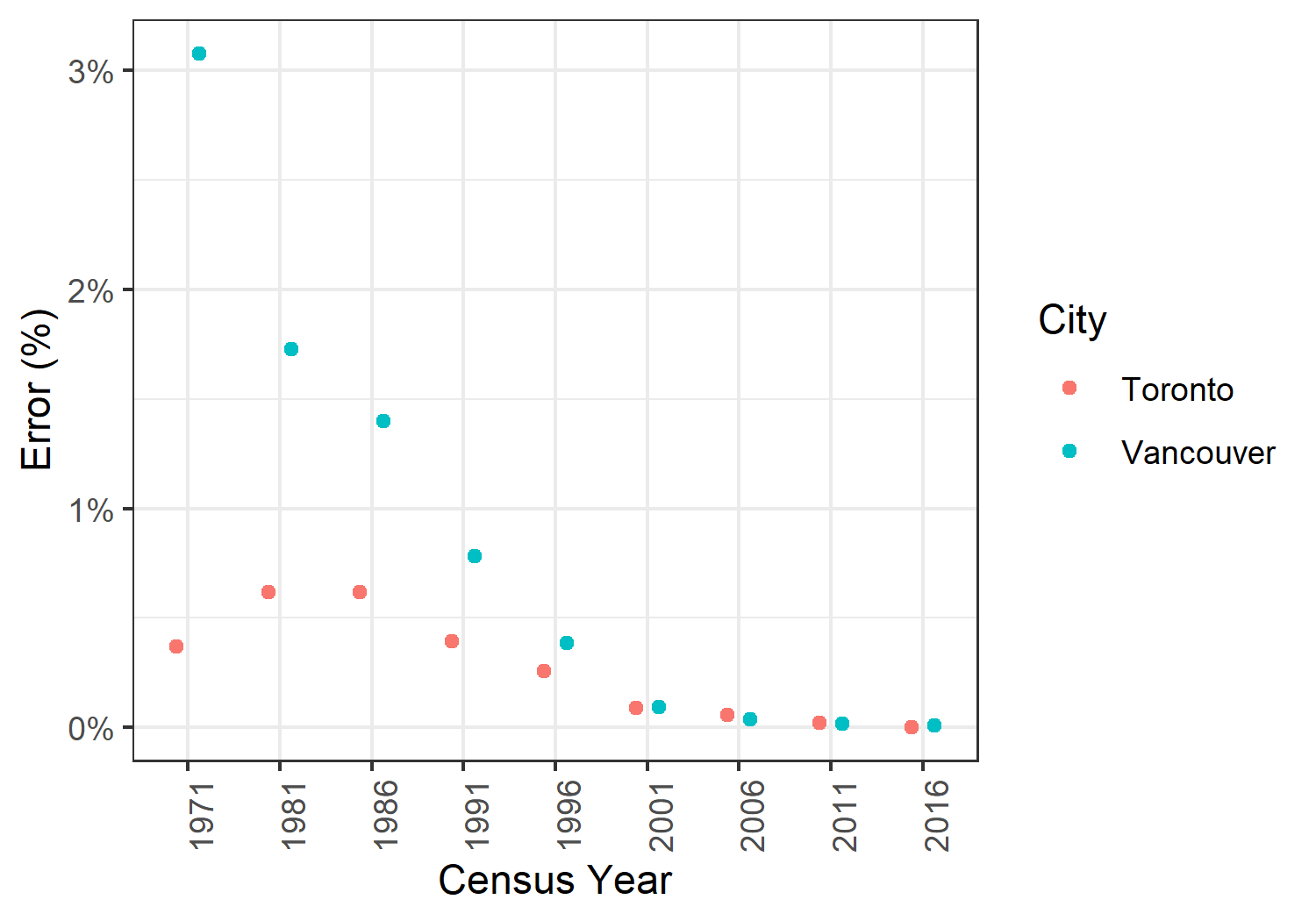
The sum of the DAs is slightly less that the total count, ranging from 3% in Vancouver in 1971 to effectively 0% in the two most recent censuses for both cities (Figure 6). I am not sure why there is discrepancy but given its (relatively) small size, it is unlikely to impact any of the following analyses.[4]
(2) Population growth decomposition
Since 1971 the populations of the Toronto and Vancouver CMAs have more than doubled, meaning these cities have led national growth in Canada (which increased by a more modest 63% in this period). From a demographic perspective, population changes can be decomposed into natural population growth and net migration. I suspect that the latter has accounted for most of these cities’ population increases. From a geographical lens, population growth can come from either the formation of new neighbourhoods on previously uninhabited sites, or through increased population density on existing land. As Kramer’s Figure 1 at the start of this post showed, many neighbourhoods have lost population (i.e. have become less dense). If this is the case, how has the distribution of density gains/losses changed over time? And even if the net density has increased, what is the distribution of this change?
Figure 7: Historical population growth
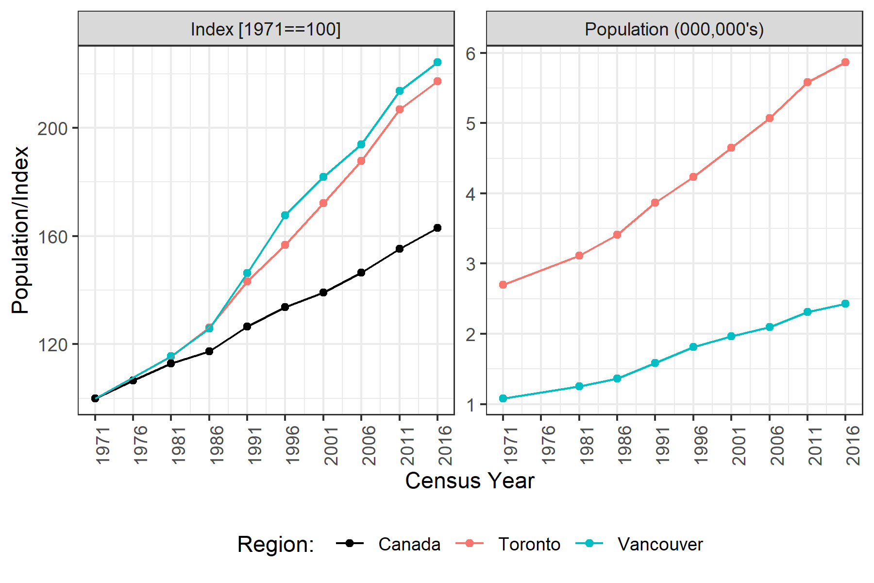
Figure 3 showed that from 1971 to 2001 there were significant increases in the number of DAs in both cities. But Figure 7 shows a fairly consistent increases in the population over time. Prima facie, this would suggest the initial population increases in Toronto and Vancouver were driven by new neighbourhood formation, whereas the 2001-2016 period would be driven by increasing densification. To estimate the magnitude of the effect of densification, one can pick an index year and calculate the population growth using only the neighbourhoods that existed at that time. Figure 8 below calculates the counterfactual scenario for all index years leading up to 2016.
Figure 8: Counterfactual population growth
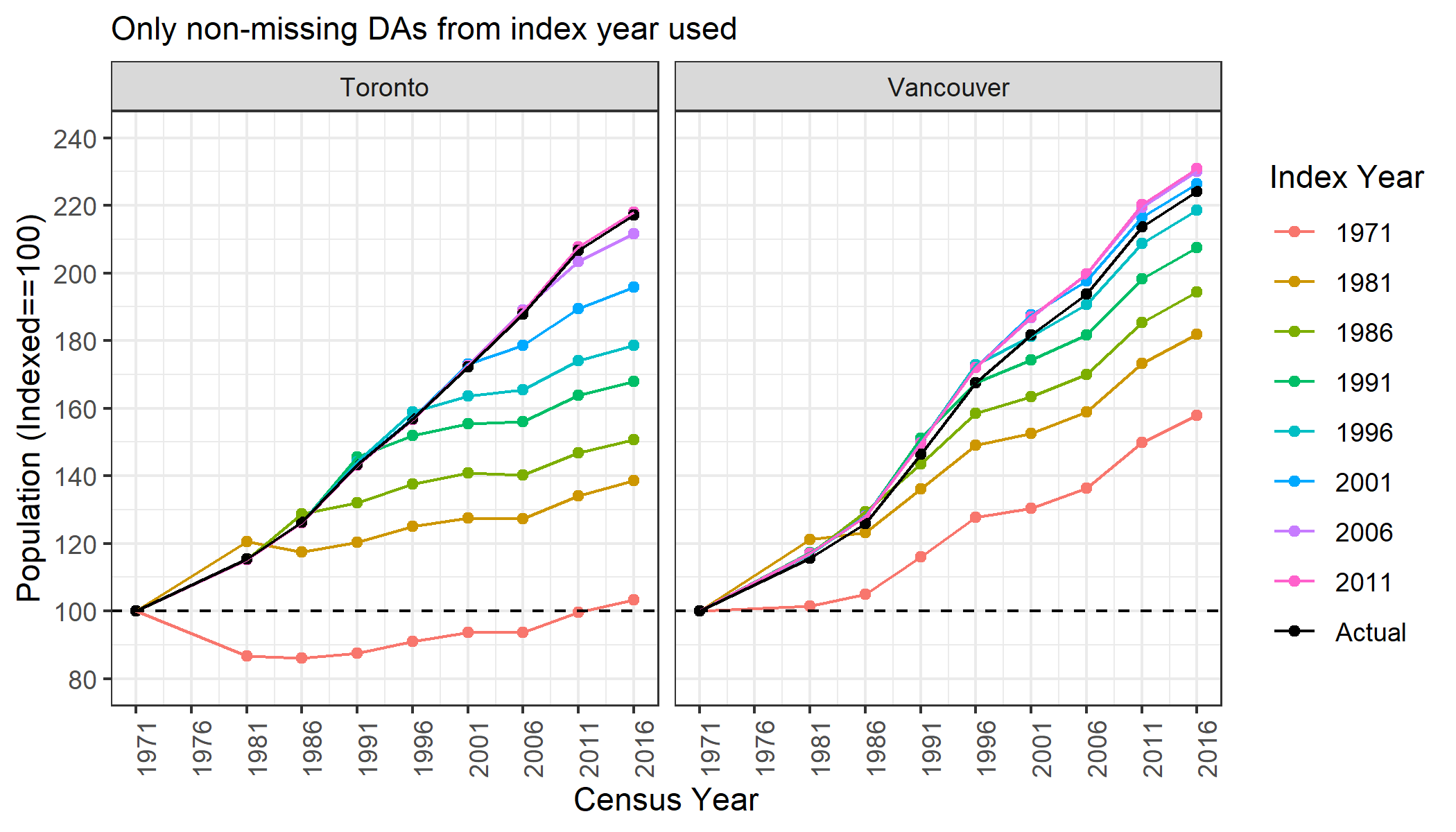
For most of the census years, the population growth from existing neighbourhoods has been lower than the overall CMA’s growth rate. Although there is a noticeable timing discrepancy between Toronto and Vancouver in this regard. For Vancouver, as Figure 8 shows, the percentage increase in the population from existing DAs starting in 1996 is roughly equivalent to the overall population growth of the city. In contrast for Toronto, only in 2006 does population growth for existing DAs roughly match the overall population change. Somewhat shockingly, the 3885 DAs measured in Toronto in 1971 have, on net, seen no population growth over than last 45 years!
Next, looking at the actual data we can see how much densification of existing neighbourhoods versus new neighbourhood formation was responsible for the increase in population across cities.
Figure 9: Decomposition of CMA population growth
 |
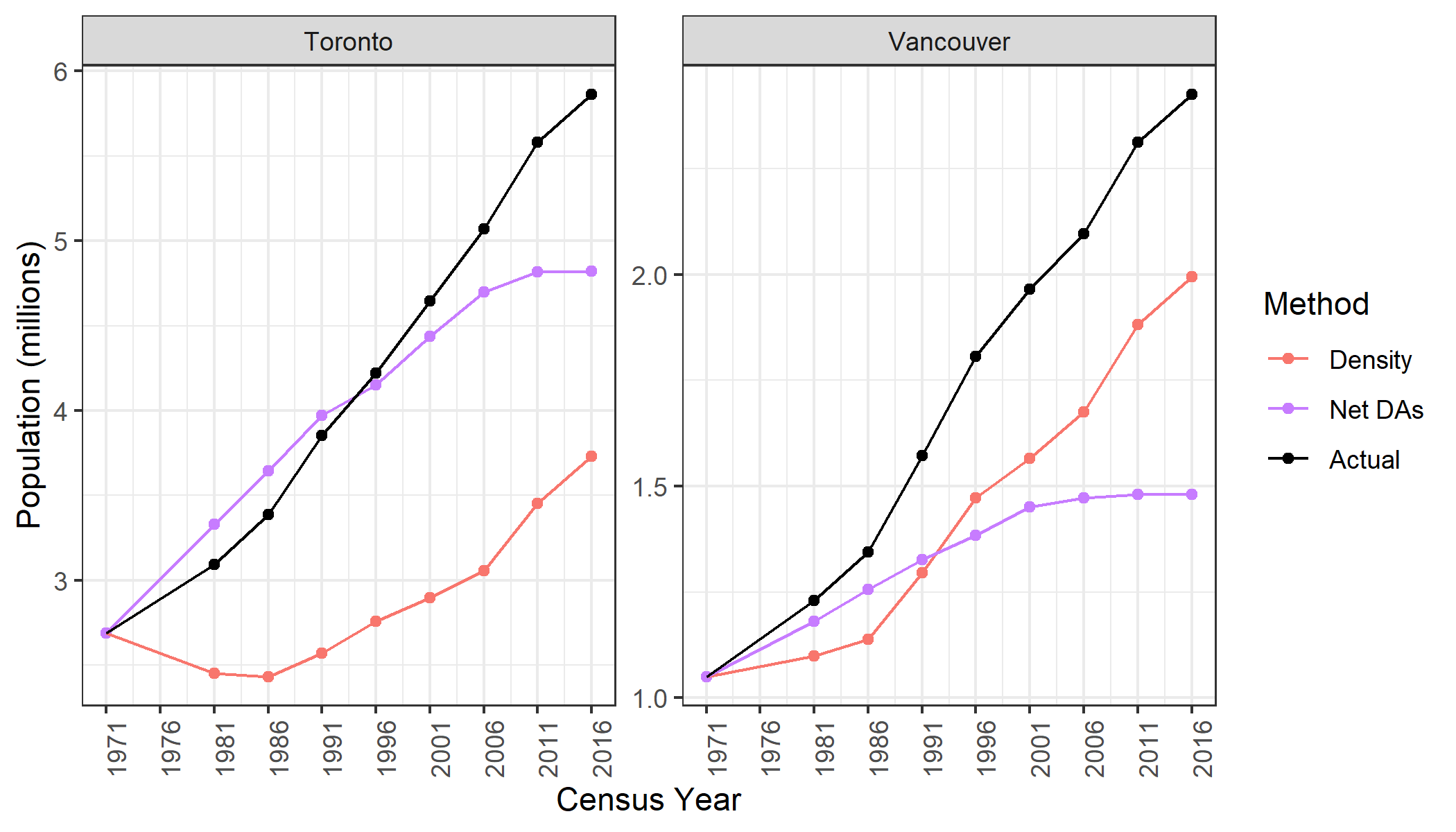 |
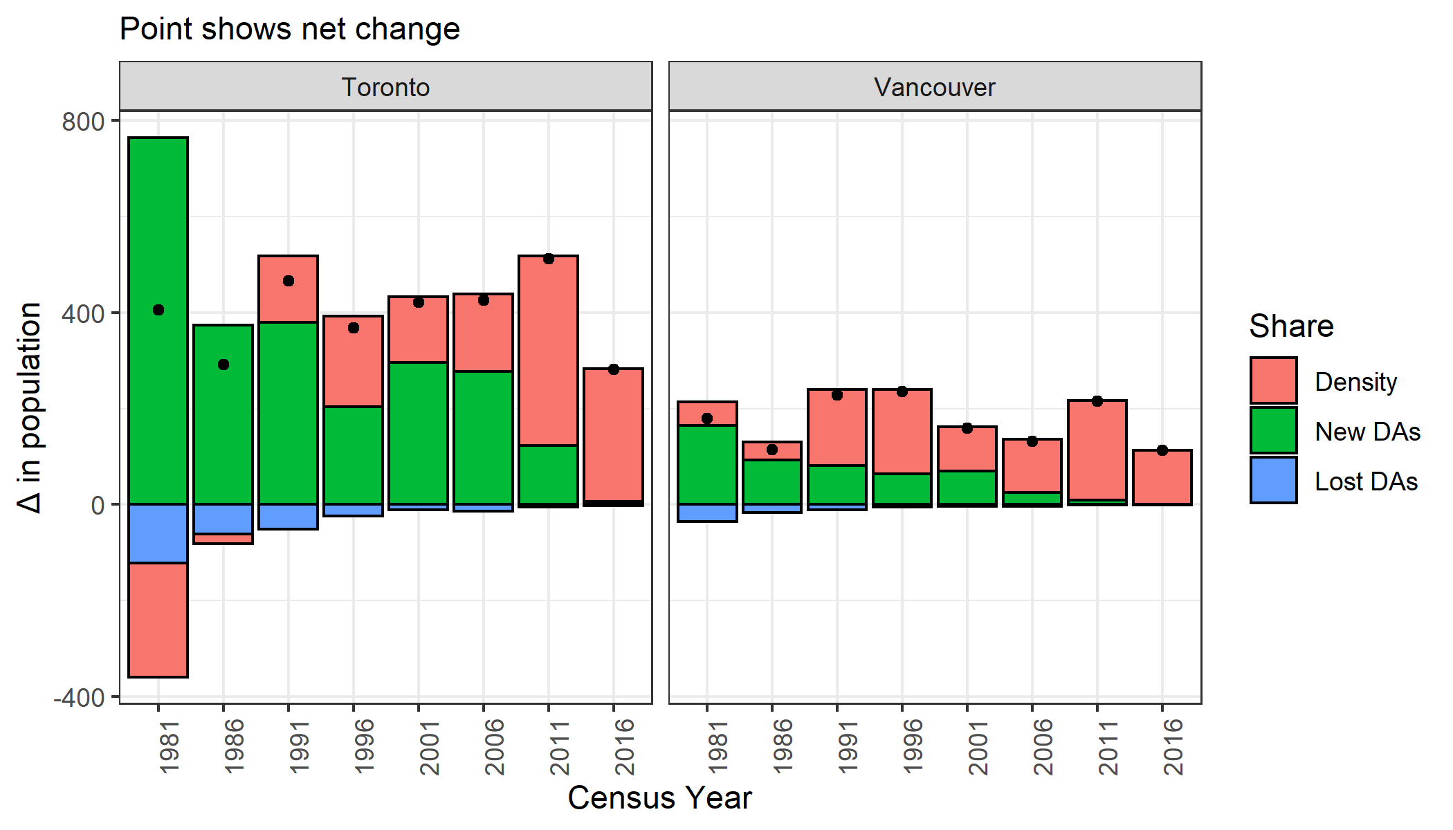
Most of Toronto’s population growth until 2006 has been driven by the formation of new housing developments (net DAs). In contrast, most of the population gains for the Vancouver CMA have been through increasing densification of existing DAs since 1991 (net density). Roughly two-thirds of Toronto’s population gains since 1971 have come from net DA formation, whereas Vancouver is the opposite: two-thirds of its growth has come from increased density within DAs and only one-third from new DA formation. Notice that while the composition of population growth has changed, the five-year population increases have been fairly steady at around 400K and 200K for the Toronto and Vancouver CMAs, respectively.[5] This means that the population growth in these areas is actually slowing down, since the denominator is growing but the numerator is roughly constant.
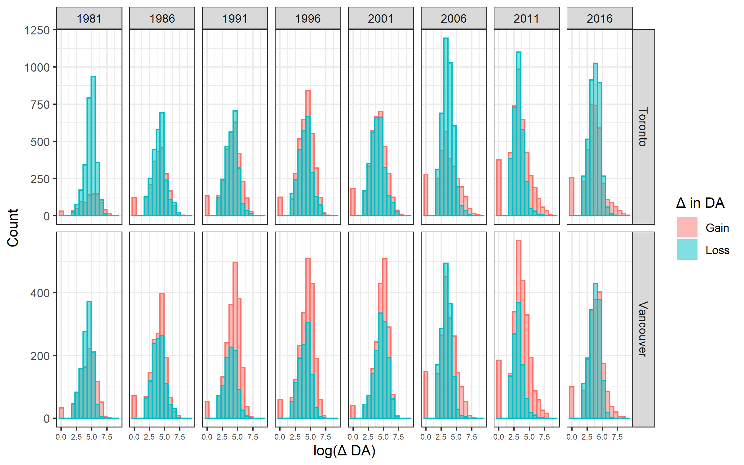
Figure 9 uses the term “density” to describe the net increase in population between censuses for those DAs that were found in each respective year. However, it would have been more accurate to describe this as “net density”, since some DAs lost population, whilst others gained. For both CMAs, there is significantly more variation within DAs than the net figure would suggest.
Figure 10: Population changes within DAs between censuses
| (10B) Breakdown of net DA changes 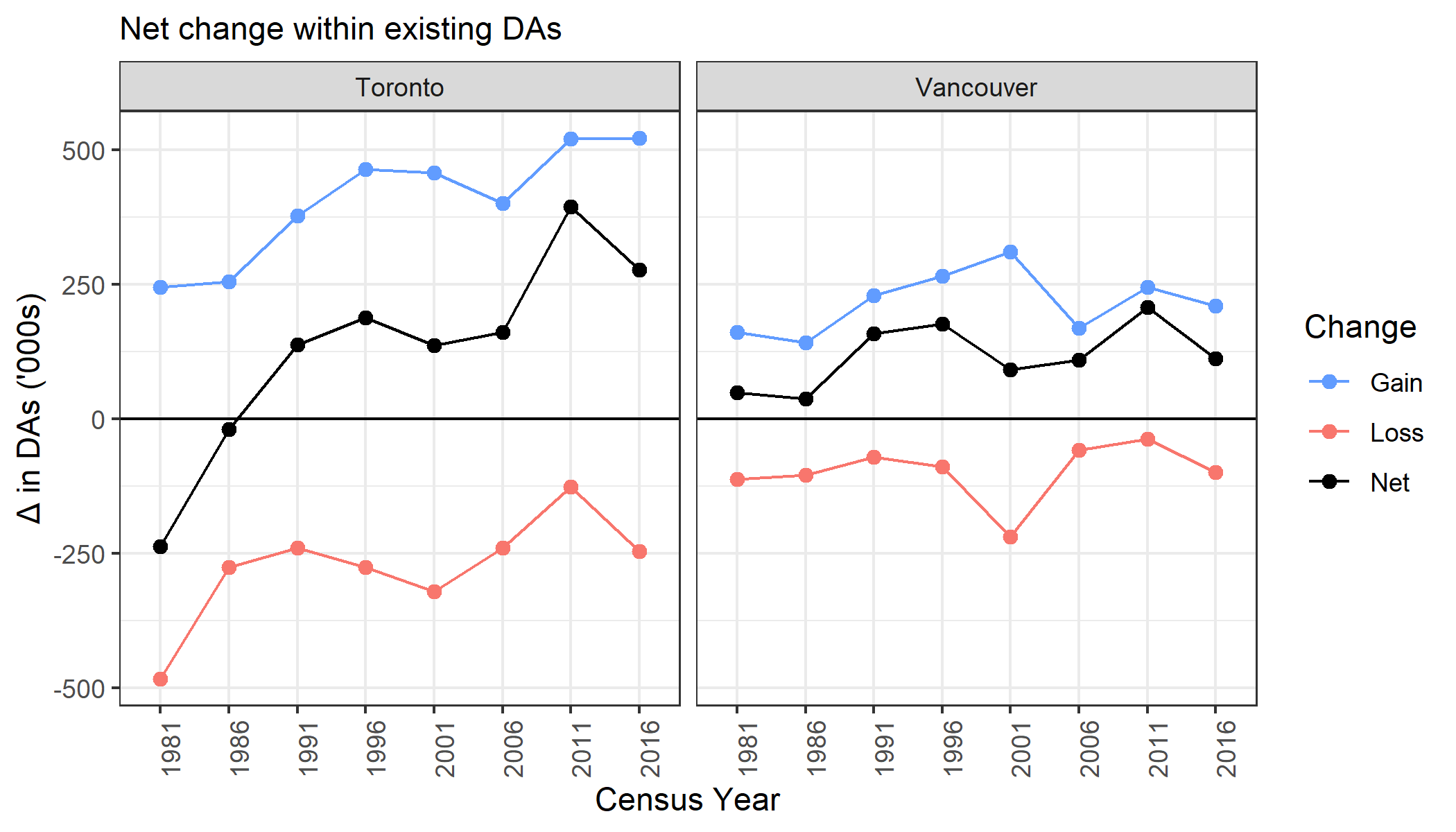 |
(10C) Number of DAs by change 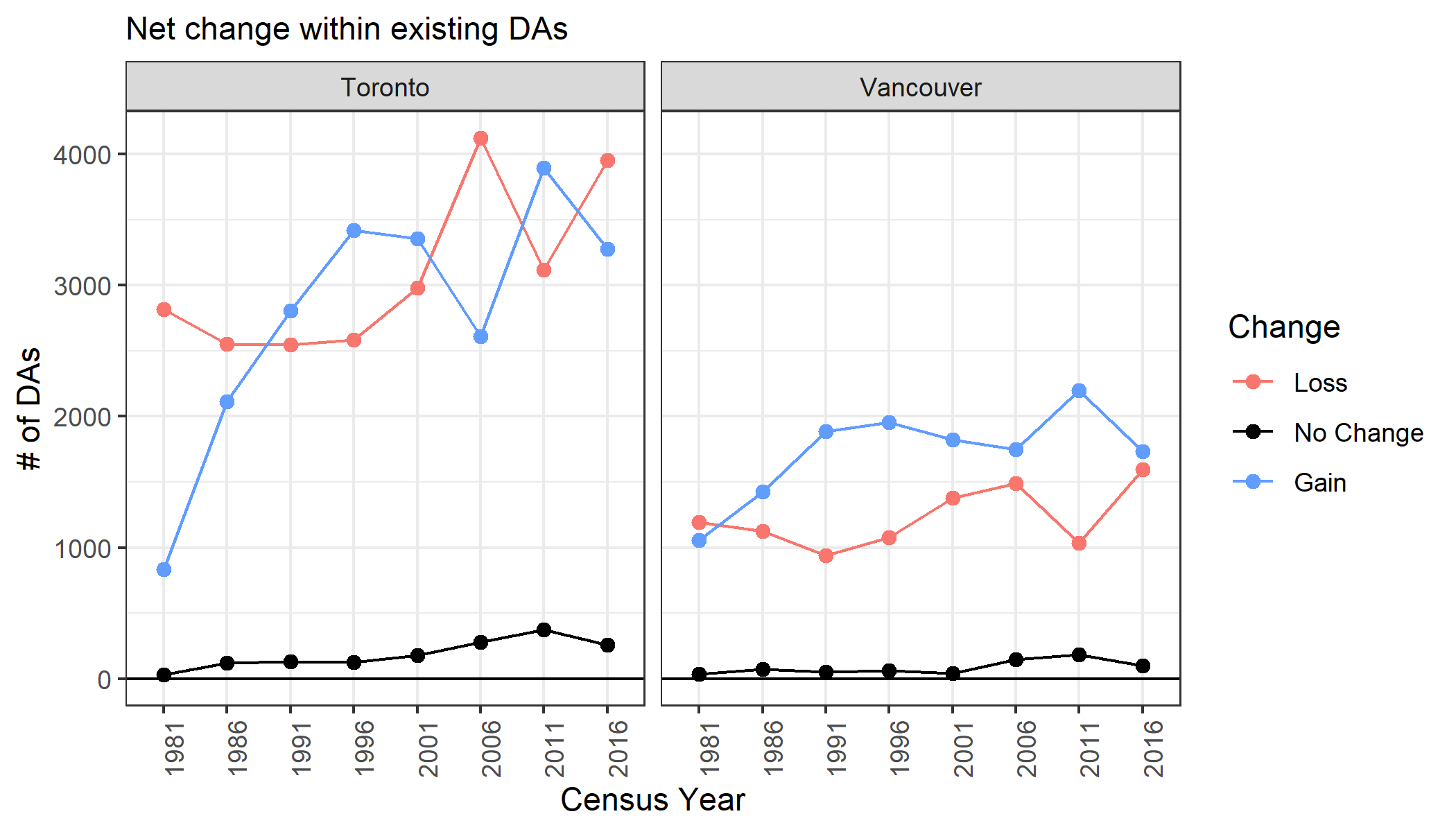 |
Figure 10 reveals some fascinating dynamics within the data. First, the range of population changes is distributionally very similar for both increases as well as decreases in density (10A). Since 2006, there has been a larger right-tail for (log) positive changes, implying a small number of neighbourhoods are contributing disproportionately to gains in the population. Every five years, the Toronto and Vancouver CMAs see a loss of (roughly) 250K and 125K people in de-densifying neighbourhoods (10B), respectively. Declining populations in some DAs puts additional pressure for growing DAs to intensify their densification even further. In Figure 10C, we see that the number of DAs which experience a gain or loss in population is roughly equivalent, especially for Toronto. Amazingly, there were more DAs which lost population in the 2016 census (relative to the 2011 one) than gained in the Toronto CMA! The fact that the net density increase was still 250K shows that the DAs which gained must have increased substantially more than the DAs which lost population.
If gains in density are stemming from outsized gains in a handful of neighbourhoods, are these gains spatially concentrated? Figure 11 below shows that this is undoubtedly the case in both the Vancouver and Toronto CMAs. What is visually striking about this image is to see how few DAs within the City of Toronto and Vancouver have seen a substantial population increase. Instead, large gains are coming from suburbs like Brampton, Vaughan, and Markham in the Toronto CMA, and Surrey and Coquitlam in the Vancouver CMA.
Figure 11: Geographic concentration of population gains in DAs
| (11A) Toronto CMA 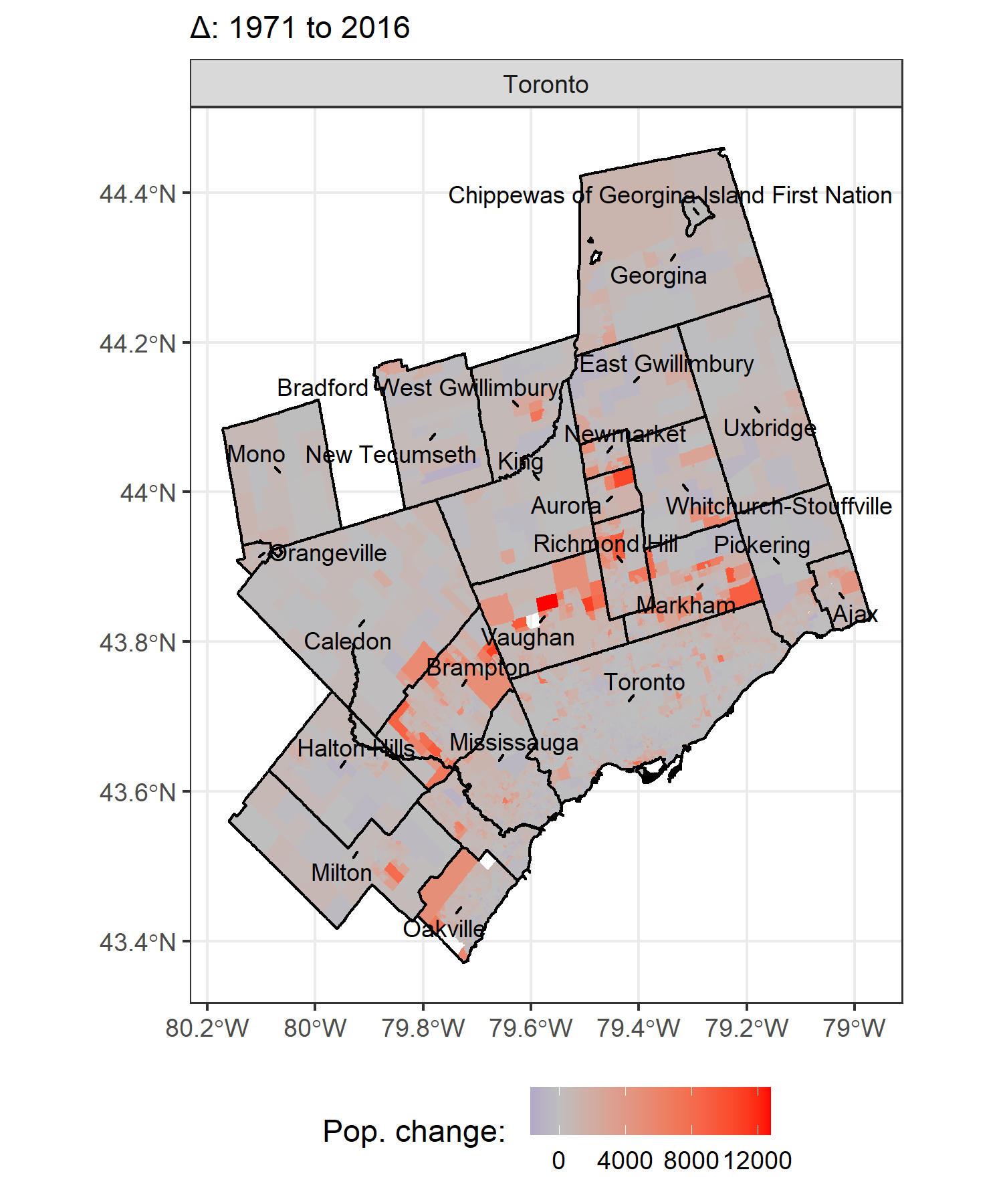 |
(11B) Vancouver CMA 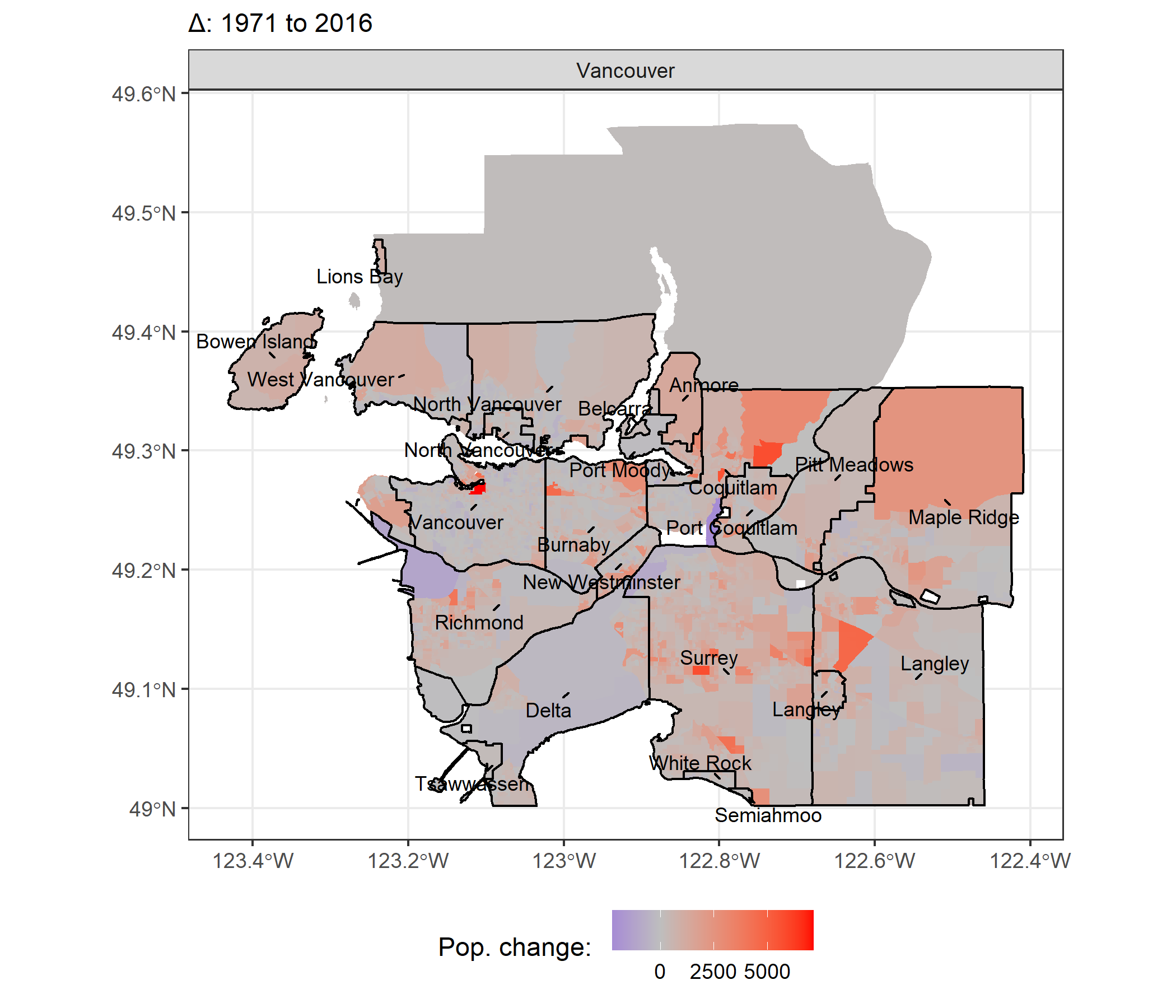 |
Population gains on the DA level were spatially correlated with both in the sense that nearby DAs were more likely to experience an increase if a neighbouring one did, but also in that they aligned with the CSDs within a given CMA.
Figure 12: Gains in population by CSD
| (12A) Pop. growth decomposition over time 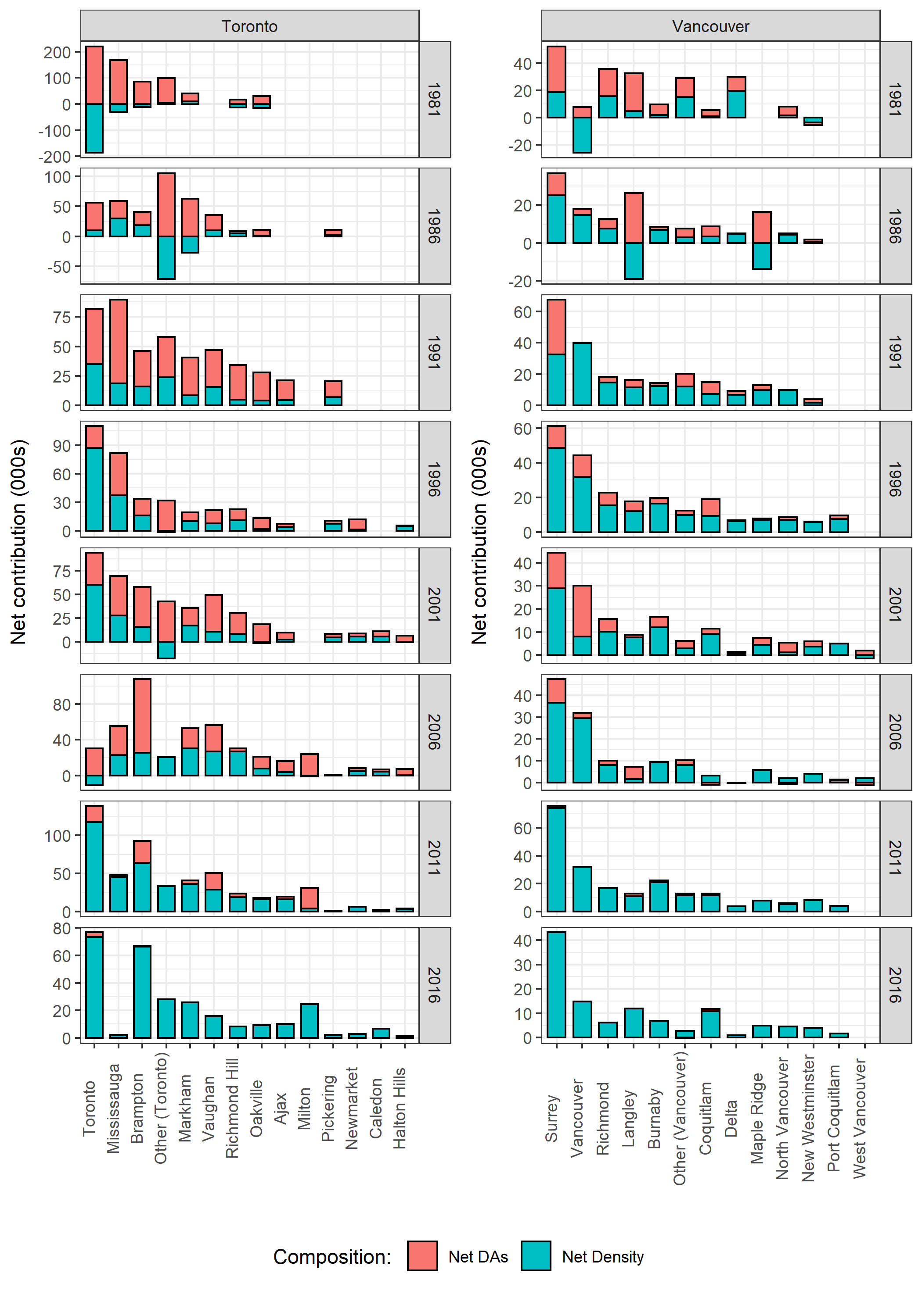 |
(12B) Total change 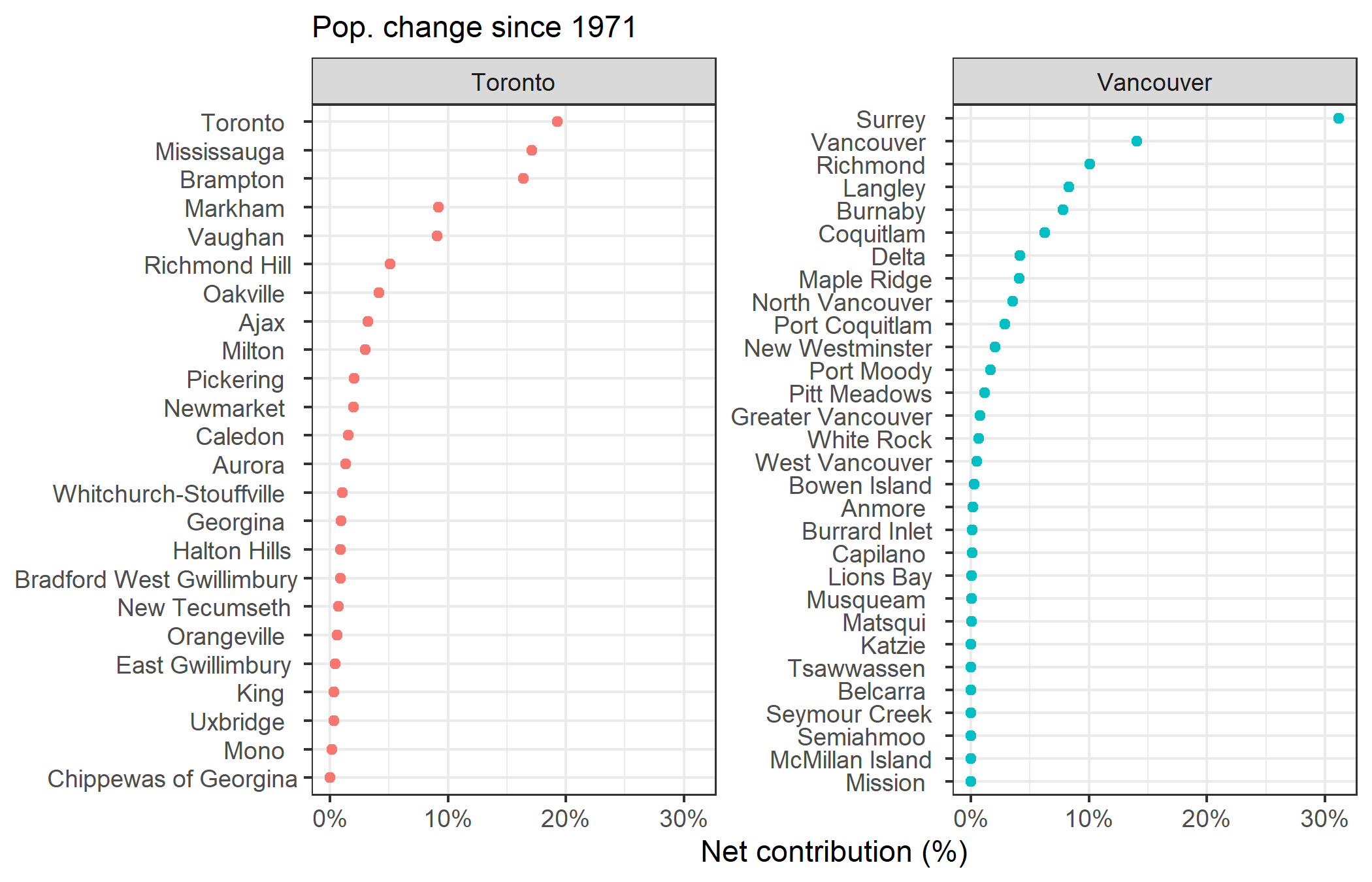 |
Figure 12 shows how the different CSDs have contributed to their respective CMA’s population over time, as well as whether this growth came from density or new developments. CSDs in the Toronto CMA like Mississauga and Brampton added most of their population increases through the creation of new DAs. The “Other (Toronto/Vancouver)” refers to the CSDs that lacked sufficient population on their own to be visually distinguishable. This includes areas like Aurora and Ajax in the Toronto CMA or Tsawwassen and West Vancouver in the Vancouver CMA. Mississauga is an interesting case in that it saw substantial population growth over time, mainly through net DAs, but as of 2016 had almost no net population change. Brampton has an impressive track record of maintaining a high population growth rate whilst pivoting away from net DAs to net density.
In the Vancouver CMA, the City of Surrey has led population growth every census period, and has managed to grow substantially from pure net density in the last two censuses. As a result, Surrey has contributed to almost a third (31%) of the Vancouver CMA’s total population increase since 1971 (10B).
(3) Spotlight on the City of Toronto’s Neighbourhoods
The City of Toronto has 140 Official Neighbourhoods including iconic areas like The Annex or Casa Loma. I will capitalize “Neighbourhoods” to make it clear when I am referring to these areas (rather than DAs). My prior belief that many of the city’s Neighbourhoods have experienced little change over a 45 year period were confirmed. Figure 13 below shows that most areas have added few new DAs, and very little net density. As Kramer’s Figure 1 showed, I found that a vast swath of Toronto, from Islington City Centre to the Beaches, have remained stagnant (in terms of population growth).
Figure 13: Toronto Neighbourhoods' cumulative population change by growth type
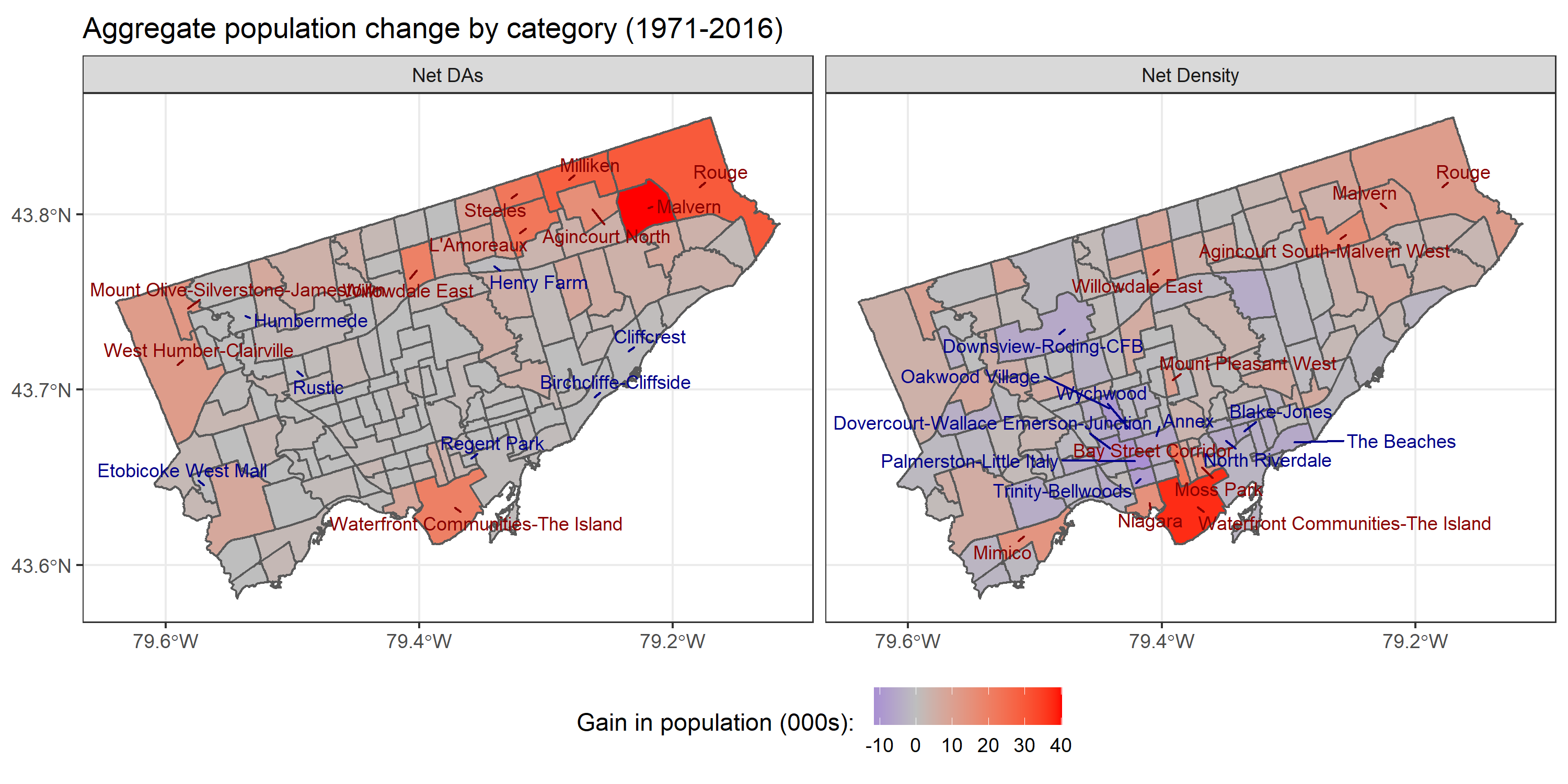
The distribution of these population level changes can be seen by the city’s pre-amalgamation boundaries. The median Neighbourhood growth is close to zero. Outliers in Etobicoke, North York, Scarborough, and Old Toronto are responsible for the positive level changes (see Figure 14).
Figure 14: Distribution of Neighbourhood growth
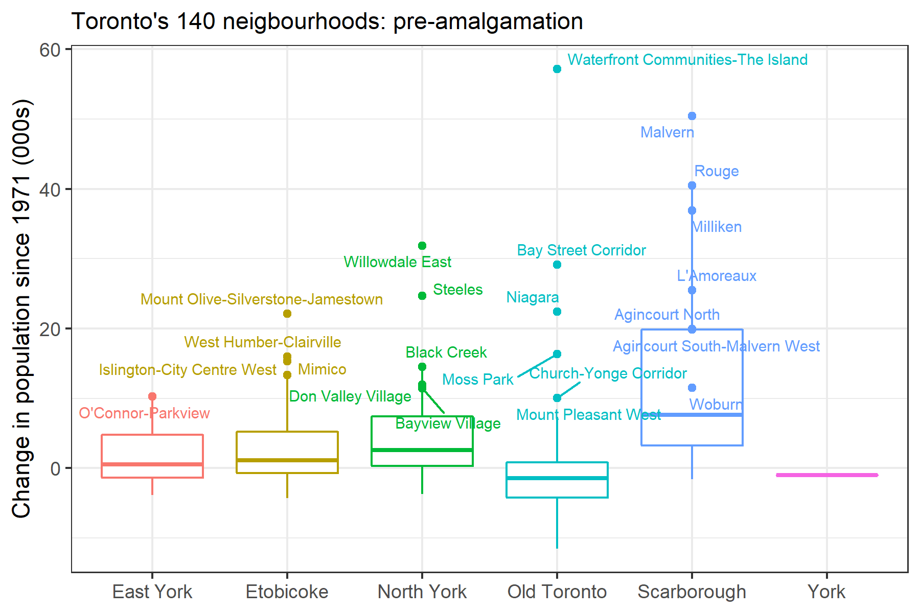
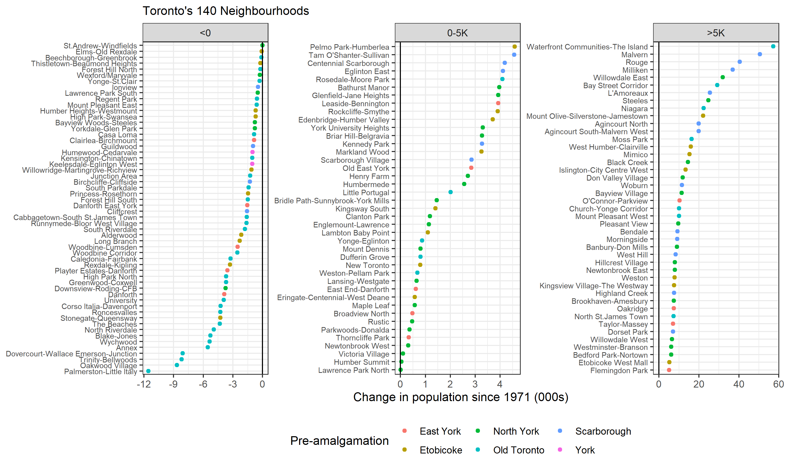
To better categorize the Neighbourhoods by level changes, I split them into i) areas which had a smaller population in 2016 than 1971, ii) those that saw a small population increase (0-5K), and iii) those that led population growth (>5K). The plurality of Neighbourhoods saw a population decline (56), and only 20 had population increases of more than 5K. The usual suspects for population decline include many of Toronto’s nicest neighbourhoods such The Annex, University, or The Beaches. A full 71% of Old Toronto’s Neighbourhoods saw population declines, the only area other than York in which the majority of locations saw de-densification.
There should be little surprise that Neighbourhoods like The Annex have no population growth. The residents of these areas are rich and politically connected. The case of a proposed zoning change to 321 Davenport is illustrative. Horrified at the prospect of “…an existing two-storey commercial building at 321 Davenport Rd., south of Dupont St., to be demolished and replaced by an eight-storey building with 16 condo units and 30 parking spots in a two-level garage,” many Annex residents petitioned the city to stop this unacceptable development. The NIMBY reactionaries included Margaret Atwood, arguably Canada’s most famous writer, and Galen Weston, patriarch of Canada’s third-wealthiest family. The benighted residents’ concerns ranged from: “setbacks”, “privacy issues”, and “(the) precedent such large violations of bylaws would set”, to “Juliette-style balconies” and “shared trees”. Though the development still appears to be on track, it has been almost four years since the first proposal was put in place and nothing is under construction. It is no surprise that developments that take years of legal manoeuvring, red tape, and bureaucracy are not going to be selling for the cheap.[6]
Figure 15: List of Neighbourhoods by pop. level change: 1971-2016
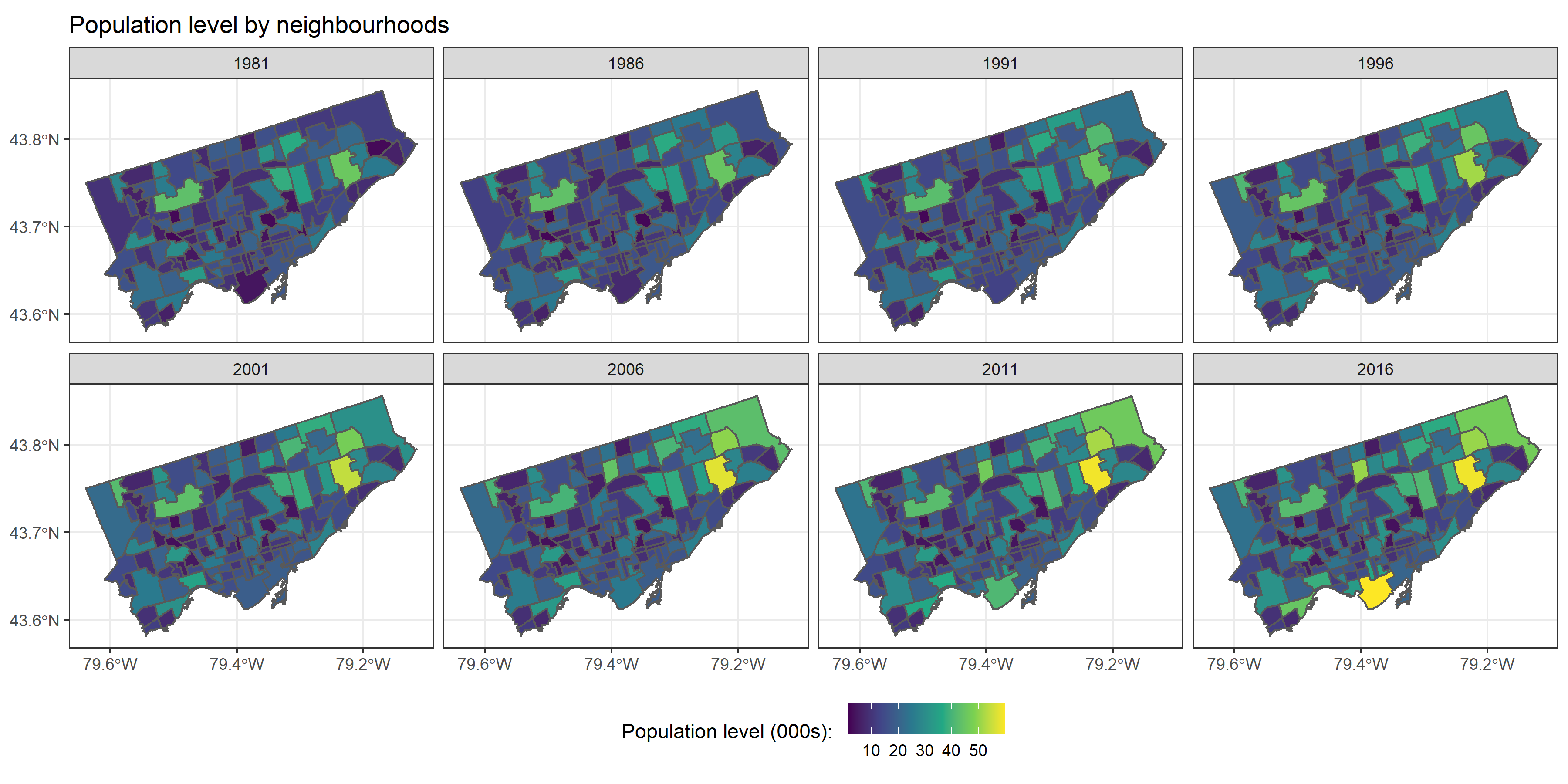
A visual time lapse of the population levels by Neighbourhood over time is also illustrative. Figure 16 below shows the sustained population increases that have occurred in Rouge as well as the Waterfront Communities (an equivalent map for the population density can be found here).
Figure 16: Population level of Toronto's Neighbourhood over time
(5) Statistical associations
As a final analysis, I wished to see whether the population level changes shown in Figure 15 could be linked to observable characteristics of these Neighbourhoods. Ideally, one would have compared the population level change to characteristics of those Neighbourhoods in 1971. Unfortunately I was not able to get this data so I used these characteristics from the 2016 census as a proxy. I examined the relationship for six variables of a given Neighbourhood: the size (km2), median family income, and housing composition between single-family, semi-detached, row, and apartments.
Figure 17: Statistical associations to population level increases
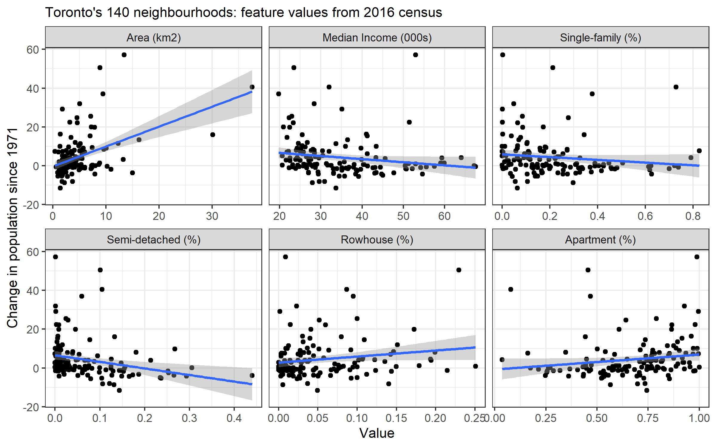
On a univariate basis, higher incomes and the share of single-family and semi-detached homes are associated with falling population levels over time. Larger land-bases and a higher share of row houses and apartments are associated with increasing populations over time. The multivariable regression results for Figure 17 can be found below in Table 1. The features have been standardized to make the coefficient magnitudes comparable to each other. The strongest effect size is the area of the Neighbourhood. This result is intuitive in that areas like Rouge have had scope for both new DA formations as well further densities (possibly) from a lower base. The share of single-family and semi-detached homes is actually associated with a decrease in the population over time. The income and row/apartment variables share the same coefficient sign as their univariate figures, although the inferences are not statistically significant.
Table 1: Regression results for Toronto Neighbourhood characteristics
| Predictors | Estimates | CI | p |
| (Intercept) | 4.37 | 2.92 – 5.82 | <0.001 |
| Area (km2) | 5.16 | 3.67 – 6.64 | <0.001 |
| Median income | -0.12 | -1.75 – 1.51 | 0.884 |
| Single-family + Semi-detached | -1.75 | -3.15 – -0.34 | 0.015 |
| Row + Apartment | 0.82 | -0.97 – 2.61 | 0.369 |
| Observations | 140 | ||
| R2 / R2 adjusted | 0.320 / 0.300 | ||
(6) Conclusion
Canada’s housing marking is characterized by an affordability crisis. Residential real estate prices have more than tripled in Vancouver and Toronto over the past twenty years. The year of COVID has been a disturbing case in point: both cities housing price indices (HPIs) have increased by 5% (Vancouver) and 11% (Toronto), despite Canada experiencing its largest contraction of economic activity since the Great Depression (a 5.3% GDP decline). International organization like the IMF have expressed concern of “household indebtedness and housing market imbalances”, with housing market prices in Toronto and Vancouver above what “fundamentals” would justify. The Bank of Canada has also signalled that it sees the federal government as the first line of defence against housing market imbalances, and is therefore unlikely to factor in asset price changes into its interest rate decision making.
The economic drivers behind this skyrocketing housing market are largely known, although there is considerable debate around which factors are the most important. Demand for housing has clearly been stoked by both market forces and policy choices, including:
- Tax benefits (most famously, the exemption of capital gains on the sale of a primary residence)[7]
- Foreign investment (Canada is seen as a politically stable jurisdiction and is especially popular with Chinese investors)
- Government subsidies (including, but not limited to, a literal equity stake available from the CMHC)[8]
- Regulations that prevent the development of new housing (i.e. influencing expectations about future supply)
- Ultra-low mortgage interest rates (the 5-year fixed is currently below 1.5%)
- Existing capital gains in home equity
These strong demand factors are simultaneously interacting with policy-induced supply constraints. Namely, that it is illegal to build low-, medium-, or high-density housing on the majority of residentially zoned land in Toronto and Vancouver. Oft-cited geographical constraints such as the Pacific Ocean, North Shore mountains, Agricultural Land Reserve, or the Green Belt are distractions from the real issue. This post has provided evidence that growth has been artificially lopsided in the Toronto and Vancouver CMAs. Small geographic areas within these cities have provided for the bulk of the population increase. This phenomenon is neither desirable nor inevitable. Greater and more uniform densification will help to improve housing options, affordability, and reduce gentrification pressures on specific neighbourhoods.
Footnotes
-
I suspect there are few greenfield development sites left in the two CMAs. ↩
-
The City of Toronto is itself an amalgamation of several large cities including North York, Scarborough, and Etobicoke. ↩
-
The following three locations have a DA-associated latitude/longitude of (43.708770 -79.342280), (43.77781, -79.34432), and (43.661352 -79.359624) respectively. ↩
-
I suspect that in order to make the DAs comparable over the years, areas which were mostly greenfield sites, industrial parks, or had scant populations had no DA assigned to them. In aggregate this would undercount the CMA. This hypothesis would also explain why earlier censuses would have a larger discrepancy, since they had fewer DAs. ↩
-
Because the 1976 census data is unavailable, numbers from the 1981 census are usually larger in magnitude because this amounts to a 10-year, rather than a 5-year, difference. ↩
-
An excellent example of this is Los Angeles attempt to build “affordable” housing units that now cost more than $525K per unit. ↩
-
There are many other benefits that come from purchasing residential real estate, including: i) sales tax rebates on new homes, ii) first-time homebuyers tax credits, iii) withdrawing RRSP funds to make a down payment, and iv) various deductions that can be made against rental income. ↩
-
See this report for a list of the some of the subsidies provided by the government to homeowners. ↩